This is where I urge you to make a shitty zine, and offer up step by step
instructions, which you should ignore as you see fit, while nevertheless
making a shitty zine of your own. I know many of my readers make stuff all
the time, and I am not yelling at you. I'm not really yelling at anyone,
but I do want to strenuously urge action on anyone who's sitting on some
super twee project that just needs to be made perfect before... blah blah blah.
We all have one of those. We just need to wait for winter to shoot the snow
shots, we need to buy a better camera, we need to find the time to shoot at
night, or whatever. Fuck it.
Make a shitty zine, and make it now. Or this weekend.
Step one: find some pictures. More than 5, less than 30. Choose photos that
are strongly graphical, they're going to be rendered badly and will have to
survive. Make 'em black and white to save money on printing. The photos can
be on a theme (subject? graphics? whatever?) or not. But don't pussy foot
around, if they're incoherent, lean in on that. Choose photos that absolutely
clash, not pictures that kind of weakly interfere with one another.
Choose fast. Maybe choose more than you need, but choose fast. We're making
something shitty, we haven't got all day. Move.
Step two: open up your favorite word processor. You can use google docs if
you like.
Your document will end up a multiple of four pages long. 8, 12, 16, 24 are all
good numbers. Maybe even 32. No bigger.
First page is your front cover. Make it punchy, make it grab the viewer. But something
striking here, but don't give the show away. The cover is your first date, and we all
know what you don't do on a first date, right?
Second page is the inside of the front cover, usually kind of throwaway space.
Maybe shove some explanatory text here, or a shitty colophon, whatever. A graphic.
Third page might be a title page, or the start of your content.
Shove in your photos. Don't neglect text. You can do anything, though. A photo
recto, and the word NO in a huge ugly font verso. It's fine. Stick a poem
in. Stick a drawing in. Whatever. Mash the content in there. If you can't figure out
how to do some layout thing in your word processor in a minute or two, do something
else instead.
The main thing
here is to find a riff you like and lean hard on it. This isn't a novel,
we're not looking for development. It's a shitty zine. One note, played
over and over, as loud as possible.
You are not Shakespeare, not today. Today, you are a Ramone. Photo Ramone, the
most obscure Ramone, but nevertheless, a Ramone to the Bone.
The second-to-last page is the inside of the back cover, and it's another
throwaway. Leave it blank, cover it with swearing, whatever.
The last page is your back cover. Put something glib here. Maybe a fake promo
quote from someone famous named Norman. Remember to be on a multiple of four
pages here. 8, 16, 24, maybe 32.
Step three: Save this document as a PDF.
Step four: There's a bunch of ways to do this, but you want your PDF document to come out
on the printer two-up, double-sided, and pages rearranged to that it makes a booklet.
I use bookletcreator for this. Google it, and grab the free download. It takes your PDF and
makes another PDF out of it which will print out properly.
Print out the latter PDF. Stack the sheets up, fold them in the middle, and staple. You might
need to go to a copy shop and borrow an extension stapler, or get creative, or punch holes and use
string instead. It doesn't matter, it's a shitty zine.
Congrats, author. If you don't find this empowering and fun, fuck you.
Wednesday, March 30, 2022
Saturday, March 26, 2022
Something to Look At
Here's a photo:
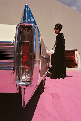
Who took it? It looks kinda like a particular guy. Kinda.
This showed up on twitter, Dr. John Edwin Mason, professor of history, was doing a little performance of hand wringing about how he tries to resist Eggleston, but cannot always do so. Eggleston is officially Out Of Favor because he's rich, white, and Southern (and, possibly, an unrepentant racist, I simply don't care enough about what random ancient white southerners think to look it up.)
What do we see here?
This is an extremely formal picture. The extreme near/far trope is deployed, quite accurately, here. The figure of the woman is almost exactly the size of the tail light, and almost perfectly aligned with it. Most of the car is colored by way of reflection. We can see the sky, and the pink ground (carpet? see the tire marks?) in the chrome of the tail-light and the rear bumper. The car itself appears to be a cream or white, but it's hard to tell because the pink material underneath so dominates. The model is wearing a black fur coat, and some sort of outré gloves in white, and a light toned shoe also peeks out under the floor length coat.
The styling of the tail light and the model's beehive date the photograph to the 1960s. A Cadillac buff would be able to tell you the year of the car instantly, but it's certainly neither 50s not 70s, generally.
The tire marks in the ground material are interesting. I'd expect the styling team to smooth those out, but they do rather fill in that corner of the frame, and I think they work. They help make sense of the car.
There is a little triangle of sky upper right, doing the same work as the tire marks, as well as inserting a blue to complete the pink/blue complementary color palette, and which sky is also reflected in the tail light for a certain pleasing symmetry. The sheer formal structure visible in this thing is really fun.
This is recognizably a fashion-styled photograph. The model and the structured formality of the frame can mean nothing else.
Indeed, this is from the pages of Vogue, 1965, shot by Gene Laurents.
What makes this whole story amusing is that when Dr. Mason encountered it and had his little crisis, the photo was in fact attributed to Eggleston, and he assumed that was correct.
Dr. Mason is a charter member of the modern school of photo theory, and therefore seems to believe that things like the photographer's gender and skin color can be determined by examining the photo via the dialectic of "gaze."
And yet, here we have him unable to even notice that this definitely isn't an Eggleston. The photo looks like an Eggleston for two reasons: it's colorful, and it uses the extreme near/far trope that Eggleston used in his most famous photo, but seems to have never used again. Eggleston is not near/far guy, he is gritty urban color guy. This photo is neither gritty not urban. This photo looks absolutely nothing like an Eggleston.
On the one hand, I am inclined to give Dr. Mason a mulligan here, because it's twitter, and there was the attribution. Even on twitter we tend to believe attributions.
On the other hand, Dr. Mason discovered that it's not an Eggleston after all, but a Gene Laurents (who for all we know is also an unreconstructed racist), and declared then that he now loved the picture. This is in part jokey performance, but based on Dr. Mason's past remarks, I ascribe a lot of literal truth to these current remarks.
Dr. Mason is absolutely unrepentant about the fact that he judges pictures not on anything visible in them, but based on who he thinks shot it. It is in fact clear that he didn't really look at the picture closely or seriously, he saw the wash of color and the shine, and wanted to love it, but couldn't because Eggleston, and now it's ok to love it because some rando took it instead. This is not exactly critical engagement. This is a crude social performance to signal that he, Dr. Mason, still considers Eggleston to be Out Of Favor.
This gives us, I think, an interesting view into this world of photo theory.
Saturday, March 19, 2022
Vivian Maier Developed by Ann Marks
I recently got from the library, and then read, this recent and exciting new biography
of Vivian Maier that has everyone in a tizzy, I guess. There were certainly a bunch
of people who snapped it up before me, so I had to place a hold and wait in a queue
for a month or two. There still appears to be quite a queue, I suppose I should return
this copy in a timely fashion.
Long story short, this isn't a good book. It is the result of, apparently, a monumental volume of research, and it is not pure hagiography. Nevertheless, it is a book with many problems in detail and in whole.
The book is not written in an anodyne New Yorker voice, for which I am extremely grateful. Instead it is written in a mildly amateurish, breathless, voice, for which I am somewhat less grateful. At the same time, the book actually has a discernible thesis, and makes an argument in support of same, which in this era is wildly improbably and greatly appreciated. The argument is shit, but let us not pass lightly over the fact that the argument actually exists in the first place.
The book's goal only becomes apparent after a while, although it's fairly predictable. The aim is to present Maier as, in the first place, a Very Good Photographer, and in the second place someone who "would have" in some vague sense sought some form of Success as a photographer, except that in the third place she was Prevented By Forces from seeking same, and therefore from obtaining same (which would surely have happened if only... because she's so very...) The argument presented in these pages is not complete garbage, some sections of it are even fairly well made. The argument as a whole, it must be noted, simply doesn't stand up.
This thesis is, however, the standard position adopted by superfans, and even ordinary fans, who love Maier because... I don't even know why. The story is very appealing, in some sense. We all see ourselves as misunderstood and unappreciated oddballs, after all.
In fairness to the author, Marks, she does try to wrap things up with a fairly limp summary of the argument, which summary suggests strongly that she sees the problems with it and has no real counter except a strong will that it be the way she wants it to be.
Let us jump in.
We open with a handful of chapters detailing previous generations and the movements of multiple immigrant families, the details of infidelity, out of wedlock birth, multiple marriages, and so on. As we wade through this material, the point is unclear, but Marks will bring this material back in the last third or so of the book, to make an argument about which more anon.
This early material presents the families as oddball, disturbing, dysfunctional. To my eye these families are in fact pretty typical; I've heard exactly these kinds of stories multiple times. When European families divided up with some members staying behind and others heading to America, in the late 1800s and early 1900s, things happened. Kids got dumped with relatives. Men married new wives while the old one was still in Europe. Kids got dumped in orphanages for intervals, and then lived with a family friend for a year, and so on. This sort of thing while in some sense grotesque was not, I think, strange.
Many of the details don't actually matter to the book's argument, though.
In parallel with these notions, I observed as I read that Marks does two things at once:
First, she steers a confident course through the story. So and so did this, so and so did that, and then this other thing happened.
At the same time, she makes sure we know what a maze of contradictions are the documents she is working with. At least part of what is going on here is that Marks wants us to appreciate the Vast Effort she put in. Well, ok. Every name seems to be spelled differently on every document, dates move around, etc. Marks always has what appear to be entirely invented theories about why. Vivian Maier's brother Carl was, we are told confidently, baptized twice, at two different churches, under two different names. One cannot help but wonder if in fact we're looking at two little boys, with some overlap of names. There are an awful lot of Charles/Carls around, and even more Maria/Maries.
Notable also in this section is that Marks does a bad job with names. There are lots and lots of names in play, and many of them don't seem to be even relevant. Who cares which family it was that grandmother Eugenie was working for when Carl was born? Or really, at any time? These are details that Marks was able to unearth, so by God she's shoving them in there. In any case, it is virtually impossible to keep track of who is who, and since it doesn't seem to matter, I simply didn't bother. I assume, with a modicum of charity, that Marks didn't screw it up.
The summary of this section is, essentially, that grandmother Eugenie was a saint, and that parents Marie and Carl were awful, neglectful, and probably crazy. Brother Carl was also crazy. We will need to hold on to these critical, uh, "facts" until much later when they will be rolled out in service of the larger argument.
At this point, for about the next 10 chapters (all chapters are quite short) we cover Vivian Maier's life as a photographer and nanny. This is fairly well trodden ground, and here Marks is simply filling in details. She fills in a lot of details, and while it's not clear what point there actually is to this, there is at the very least a lot of effort expended.
I do genuinely believe in massing up detail, irrelevant or not, so I cannot grudge Marks the fruits of her labor here. The shape of the story is well known, but we know a lot more of names, addresses, dates, and so on. New York, Chicago, a trip around the world, eventually a lot of hoarding, and so on.
Throughout here Marks does a thoroughly unconvincing job of arguing that Maier experimented with becoming a professional photographer. Her evidence is apparently a couple of letters discussing the idea of starting a postcard business, and the fact that she sold a very very small number of individual prints to unknown parties. Beyond that there is photographic evidence that Maier was hanging around near professional photographers, and did a small amount of experimentation with "advertising styled" photos.
Sprinkled into later material, we note a couple times even less convincing arguments that Maier was "toying with" the idea of "restarting" her career. These remarks are distinctly odd given that Maier never started a career in the first place, and the evidence for even a serious interest in starting one is extremely thin. The evidence for a desire to "restart" is even thinner, usually a handful of photos that look "professional style."
Mixed in through all of this we have two irritating tics.
Marks attributes a lot of emotional charge where no evidence appears. People are always "darting" to places, when the record does not seem to indicate anything beyond "at some point they were present here" and so on, more or less indefinitely. This kind of language, which projects a fantasy of emotional states, is larded very very heavily through the book. It is a rare page that does not contain several instances of this kind of implicit projection. On the one hand, one doesn't want to present a tediously dry narrative of purely what is known, but on the other hand Marks sometimes seems to be constructing personality where, perhaps, not quite enough is known to do that.
The second tic is Marks' constant evaluation of Maier's photos. Marks had access to the entire archive, derived a great deal of value from it, and reproduces many photos from it that we have not yet seen. Marks is not shy about telling us how great they all are, there's always leading lines, and shapes are created by hands, and the light, and blah blah blah. It's truly amateurish, and often seems somewhat desperate. At best, Marks is a huge fan, and projects her doglike careless affection on to everything her idol has done. At worst, it is the closest the book comes to outright hagiography.
At one point Marks is at great pains to deconstruct a mirror selfie, quoting "photographer Dan Wagner" droning on about how hard these shots are, because she had to focus and then — without moving a muscle — pose and press the shutter button. This is all very well until you realize that the focus is all fucked up. It's on the wall behind her, the heating vent in the wall is sharp, Maier is not. Selfies are harder than they look, sure, but come on.
Chapter 14. This is the real nub of Marks' argument, and it's really really problematic.
This is where Marks brings back the family history, and merges that with a bunch of armchair psychology. She interviewed at least three psychologists, specifically on Maier, and interweaves that with her own ideas and theories, arriving at a result.
The result is that Maier was nuts, and she was specifically nuts because of some combination of Bad Genes, and Abuse By Her Mom Who Was Also Nuts, and Abandonment By Her Dad Who Was Also Nuts, and Maybe/Probably Some Sexual Abuse Somewhere Along The Way (for which exactly zero evidence is available.)
Well. That's a sort of a Holy Shit kind of moment.
Ok, Maier is widely remembered as kind of an odd duck, and she definitely had at least something of a hoarding problem. These are pretty well documented. Her brother seems to have at some point been diagnosed as schizophrenic, assuming that Marks has actually identified the right Carl Maier, but that Carl Maier was also a drug addict so...
The fact that Marks was able to, apparently, rope actual certified psychology professional(s) into actually offering even tentative diagnoses based on verbal descriptions of information gleaned from conflicting documents and interviews seems bonkers to me. Surely you could lose your license for this kind of thing? I don't even know, but I found the whole thing disturbing. I went so far as to look some of the shrinks up, and the two I checked on seem to be real people, with real credentials, and real jobs. These are not a bunch of crystal waving hippies.
Having wrapped up this distasteful business, we return to the details of the last years of Maier's life, now informed by the diagnosis of Hoarder Syndrome or whatever it is, and we can now be sure that the reason Maier never developed most of her later film, and never shared photos, is because of her mental illness. Which is just head-clutchingly awful as a theory.
I'm not so progressive as to simply rule out "ok, it's because she was nuts" as a legitimate explanation. On the other hand, I do think you need some pretty sturdy evidence, and I think some temporizing language would be appropriate. Marks is not blunt or mean, but she does not temporize and her evidence is not particularly sturdy. This is her theory, and she's sticking with it, and I think that is a bridge, or several bridges, too far.
The book carries on through Maier's quitting photography, her death 10 years later, and the various shenanigans surrounding the discovery and promotion and controversies around Maier's work, all of which have been thoroughly documented elsewhere. Marks adds little or nothing here, except the usual extremely optimistic spin.
Let us return to the book's thesis: Maier was extremely talented, Maier "would have" wanted success as a photographer, except for "external forces."
The pictures we're shown in the book do not remotely support the talent theory. Indeed, it becomes clear that the vast majority of Maier's oeuvre is well made snapshots, and a surprising amount of it is stuff like newspapers photographed page-by-page (exactly how much is left unclear, one darkly assumes for nefarious reasons). The bangers have all been located and reproduced ad infinitum, and that is likely that. We have seen essentially all the "good ones."
At the same time Marks wants us to be sure that Maier's photos are intensely emotional and profoundly humanistic, and definitely not just snapshots that accidentally looked particularly like a Bresson or a Frank. In order to imbue the now mentally ill abuse victim Maier with a deeply felt emotional sensitivity, grandmother Eugenie is drafted. Surely it is from the saintly Eugenie that Maier acquired her deep sensitivity to the human condition and was thus able to shoot these deeply sensitive humanistic photographs that are deeply sensitive exposés of the human condition despite Maier herself being mentally ill and thus unable to form normal human connections.
Christ. My head hurts.
Just to review, one of the things that is now fairly clear is that Maier managed, in 40 years of shooting, producing an archive of 140,000 photographs, to produce something like 50 pictures that look kind of like other famous photographs. That's it. That's literally it. There is nothing else. Everything else is snapshots (mostly snapshots) and photos of newspapers and the personal effects of her employers (ok, maybe she was nuts?) and pictures of her own shadow and probably another few categories is idiosyncratic fluff.
Back to the book's thesis, item two, Maier "would have" wanted success as a photographer:
The vague feints at arguing that Maier wanted to "go pro" in any sense are ridiculous. If you've spent any time with shutterbugs, you know that every single goddamned one blabs about this unseriously from time to time. If Maier ever seriously manifested a desire to "go pro" we have no real evidence of it, and that is that. Marks clearly made a valiant effort to find supporting evidence, but literally all she could dredge up is things like: well, she took some fairly lame attempts at advertising styled photos.
I have made better efforts, and have never had the slightest interest in "going pro."
Onwards to the "thwarted by external forces."
Here we have the novel idea that it was Maier's childhood of abuse and genetic disposition to mental illness, leading to her own illness, which prevented her from seeking greatness. The hoarding of newspapers speaks to a desire to hold things close, which, somehow, explains why Maier stopped developing the film, I guess because... she already "possessed" those images, so she didn't need to develop the film?
From where I sit, in the cheap seats, this seems just a jaw-droppingly terrible theory. It's offensive. It's not well-supported enough to justify its unsavory implications. It's much too complex to explain the facts at hand. The only reason to suppose "it was the craziness that done it" is because it allows, albeit via a tortured argument, Marks' to "explain" Maier in a way that appeals to her fandom. Seen in those terms, which I think we must, it's quite yucky.
In a section entitled "The Legacy" of an Appendix, Marks wonders at length what Vivian would have wanted.
This is curious, because we don't need the subjunctive here. Maier had agency, and at least some money, we don't have to wonder. We know. She wanted to not develop the film, to sit on a bench reading, to apply vaseline to her hair daily. There is no speculation here. Indeed, Marks is at some slight pains to note that Maier in fact had the resources to develop her film, even at the end of her life. Maier died with several thousand dollars of uncashed checks, a moderate bank balance, and so on. The fact that she had not taken any photos, or developed any film, for at least a decade was decidedly a choice.
The conceit though is that, what if the obstacle, the alleged mental illness, had been removed?
Well, on the one hand, why don't we imagine what she would have wanted if we'd chopped her fucking legs off while we're at it? Who the hell cares what Vivian Maier would have wanted if she had been a different person? This entire question is idiotic.
On the other hand, ok, let's assume that mental illness was in the first place important here, and that in the second place can somehow legitimately be elided for the purposes of thinking it through.
The answer is, and Marks admits as much in the end "we have no idea."
But Marks is a superfan, so of course she lands on the side of "well, let's pretend."
In the end this thing is a monumental effort of biography. Marks expended great effort piecing together a lot of detail, and I am willing to believe she got it substantially correct. A great deal of detail is now available in Ann Marks' files which, if it turns out that Maier gets to join the pantheon of people who are important, will no doubt be wonderful to have.
At the same time, it is a completely bonkers act of fandom. Marks so very much wants Maier to matter, and she wants so very much to explain Maier, that she's constructed a ludicrous tower of cards to support a theory that is, in the end, pretty offensive. This is a theory that will empower the already convinced, the other superfans, but nobody who looks at this book seriously is going to find it convincing at all.
Indeed, the masses of photos reproduced are pretty cringeworthy. We see, for the first time, what the archive actually might look like. I could not find an exact count, but conservatively we're seeing 300 photos that we've not seen before. The published "art books" have something like 50-100 bangers, and another 100 or so vaguely decent filler. This adds 300 or more, which are clearly inferior. The text makes clear that large swathes of the archive are somewhat less than filler. At this point we've seen 500 photos or so, photos that have been picked over as somehow especially noteworthy.
I am confident that this is in fact it. You could already tell with Out of the Shadows that you didn't have to go too deep into the barrel to start finding pretty dull photos. With this latest book we're digging deep into the smellier parts of the midden, and coming up with pretty much what you'd expect from a midden. Now, these are not shitty pictures, they're not wildly bad. They're generally well made snaps, but most of the new pictures we're seeing with this book are unambiguously snaps of no great import.
In the end, the book is not scholarly, but it is interesting to the existing fans who will be most of the audience. It is confident in its story well beyond what the evidence appears to support; it tells a singular straight-line story with no waffling or question marks despite the clearly conflicting document trail.
The book lays out and works its way through a cogent argument, which argument will surely be convincing to the fans because they already believe the story. Indeed, if Marks had been able to genuinely fill in each of the steps in her argument, it would have convinced me as well.
The essential problem Marks encounters in really making each step of her well-laid plan convincing is that none of it is actually true. Supporting evidence for each step is necessarily strained, because it is being stretched to support something that simply isn't true.
The Maier-mania has been fading. This book will probably create a small pop of interest, mainly among superfans, and then perhaps we can lay the whole misfortune to rest.
Tuesday, March 15, 2022
Something to Look At
Here's a picture. You've probably seen it, or one of the probably dozens of similar photos of the same scene.

What do we see?
A building with all its windows broken out. The damage appears more violent, more structural, as the windows get closer to the camera. We can see dangling wires, or re-bar, or both, that very much give the flavor of some sort of violence. On the ground below the most damaged windows, some sort of debris which visually resembles the cladding on the building we see further away, near the less damaged windows. The debris, credibly, is cladding that has been blown off of the building. The color and texture of the building changes in ways consistent with this hyopthesis.
Nearer to us, a littered ground that appears charred or possibly covered with ash or grey debris; a broken-off burned tree; a small fire; a nearly destroyed car. In the distance, another car apparently burned out.
This looks like an explosion occurred inside the building, but the damage extends beyond the scope of a single explosion. It feels broader.
The captions that this picture and its companions come with indicate that the building was a maternity hospital in Mariupol, Ukraine, which building was bombed out by Russian military action. I think this precise picture is actually a handout from the Ukraine military, but that is neither here nor there. Consider it a placeholder for a type.
Let me be clear up front: I see no reason to suppose that this caption is not completely accurate. If it were false, I believe we would know about it, and it would be a scandal, and so forth.
That said, there is nothing whatsoever in the frame that appears to support the details. This is a completely generic photograph of a bombed out building. The only reason to suppose that it's the result of war is, really, the distant car. Everything else we see could, conceivably, have been caused by an accidental explosion inside what appears to be a completely generic building.
Possibly I am missing something, but I see literally nothing in this photograph that particularly dates it (the cars might give you a general idea if you examined them minutely?) or identifies the building or the building's function. This could be a school in Yemen, a printing company in Afghanistan, or a government building in Sarajevo. What is legible is that this damage is, at least consistent with if not certainly, the result of a military conflict.
I have argued in the past and no doubt will again that these things are generic, on purpose. This is not a photo which is designed to give us information. There are, functionally, no facts in this photograph.
The purpose of this photograph is to reify the conflict in Ukraine. It looks generic, because it's supposed to look generic. It's a symbol of war; it is a recognizable image which we can consume instantly. It means by signification, by instantly connecting to all the other essentially identical photographs from Yemen, from Sarajevo, from Dresden, from Ypres.
The text of the story says that a hospital was bombed in Mariupol with loss of life and other consequences. The photograph serves to reify the story. It does so not by offering supporting facts, it does so by existing. This is a photo. This is real.
The reasons to suppose the photograph is actually the hospital referred to are not present in the photograph, and neither are any other salient facts. The picture could be replaced by any other generic picture of a bombed out building, without changing anything.
The only reasons we believe the picture to be true are bound up in the reputation of the media outlets, and the social forces that to an extent keep them honest. The New York Times is not likely to show us a picture of some other building, because the New York Times has made a fetish out of showing us the right building for a very long time indeed. The New York Times has irrevocably lashed their reputation to a handful of ideas like "when we assert that a completely generic photo of a bombed out building is a specific building, it is that specific building almost all the time!"
The picture is a symbol. It signifies war, the text directs us to Mariupol. War in Mariupol. But also, it signifies that someone really truly went there. Probably someone wearing a flak jacket and a helmet, someone with a camera. Someone who took this photo of this building at some personal risk. Photojournalists are getting killed taking exactly these pictures on a practically daily basis right now.
The reputation of the media outlets demand that these risks be taken, that these people die to take these completely interchangeable photos. Only if people die can we be sure that this completely generic photo is of the building we say it is. It is that risk of death, proved by actual deaths, that proves the seriousness and authenticity of the photograph.
The fact that these things are often taken at great personal risk imbues them with a kind of power. "Oh my god, someone was actually there, in all that fire, scared and cold."
Having laid that out there, let us think more broadly.
The New York Times has lashed its reputation to minutiae like this, rather than really to any notion that it's going to give you actually good analysis, that it's going to do a good job at what we might think of as "reporting the news." Indeed, the NYT more or less famously repeats whatever horse-shit lies the US government, specifically the military establishment, is peddling at the time.
But they have not lashed their reputation to "we don't constantly fall for the DoD's transparent lies" they've lashed it to "we usually name the blown up building correctly."
This is not an accident. The Guardian has its own foibles, as does the Christian Science Monitor, as does Fox news as does NPR. The foibles are different. All of these outlets, though, unabashedly support their reputation by the promise of getting what are essentially unimportant details right, the promise that "our people" are there, taking risks, occasionally dying, and that proves our dedication to Truth, so you should Trust us.
I don't think it's too much of a stretch to suggest that journalists, photo- and otherwise, are sacrificed regularly specifically to support the illusion that our press is trustworthy. Which it manifestly isn't. Human sacrifice to bolster a lie. Maybe that's pressing my luck, but it sounds defensible.
I don't feel very good about this.
Monday, March 14, 2022
Photoland Talks
There was a series of Zoom talks moderated by Paul Halliday with his former students, each covering
one would-be artist's project. I poked my nose in while they were going on, to see what was the deal
was. Now you can check it out too!
There are four videos, which basically nobody has watched. One of them is Paul's standard presentation on his go-nowhere London project, complete if memory serves with "later, I saw the Nazi-skinhead eating a bagel, which as you may know is a Jewish thing" line. Paul's talk here is essentially a carbon copy of his talk for Chitr Sanstha and as such is a rambling litany of his "good" pictures from his long project of wandering around London with a Leica. Paul is the "programme convenor" for the Goldsmiths MA program in Photography & Urban Cultures, whatever that means. The program currently runs £11,200 for locals, £20,250 for foreigners.
Two more of the videos are talks from Kali McMillan and from Orly Zailer.
The first is starting with the archive from her iPhone. A mass of various photos, some snaps, some record shots, some attempts at serious photography, and so on. A fairly large, fairly raw, archive that represents something of a life. It's a potentially interesting starting point, and Ms. McMillan seems to be a perfect nice intelligent person. Having gotten an MA from Goldsmiths you'd think she would have developed some approach to going forward here, but it becomes depressingly clear that this is not the case.
Orly Zailer has a completely different set of photos, these laboriously constructed diptychs. This is an essentially textbook case of a rigorous process which the artist seems to hope will produce some kind of meaning. Again, we learn that the Goldsmiths MA seems to give her no tools whatever to work with here, and she is essentially lost.
McMillan and Zailer are both clearly interested, intelligent, people with interesting raw material to work with, who have somehow never been given any direction on how to make something of this material.
Zailer's project is almost a carbon copy of David Killeen's project which you can watch yet another video about here. Killeen doesn't seem to have worked out where to go with it any more than Zailer has. Killeen went through the same program within a couple years of Zailer, I think. I worked it out once but have forgotten the details. They were close, in time, but not exactly overlapping.
Maybe the Goldsmiths MA isn't what I think it is? I have always imagined it as a sort of MFA, but perhaps it's something else. I mean, I dunno, this is supposed to be the end result:
That feels pretty MFA to me? Surely a "coherent body of photographic work" is more than just a pile of thematically linked photographs?
This brings us to the last talk, from Bas Losekoot, which is a different animal indeed. Losekoot has a well defined concept, or set of interlocking ideas, and a bunch of photos that relate to that concept, which has indeed turned into a book which indeed found a publisher. The concept is not very profound but honestly I'm not convinced that profound or complex concepts are really a thing for photography. Keep it blunt, almost dumb, because photography kind of sucks. If you need nuance, use words, I guess. I don't know where Losekoot developed this skill of discovering a concept, but I suspect that it wasn't Goldsmiths. He has a fairly deep background, or maybe he's a natural.
What makes this particularly interesting to me is that, unlike the others, Losekoot's pictures are totally uninteresting. Don't get me wrong, they're well made, thoughtful, and so on. They fit the concept like a glove (or possibly the other way around.) What they are not is interesting.
They look exactly like every other contemporary street photographer's output. There's the endlessly repeated faces/bodies pointed in opposite directions as they pass, endless shallow DoF face-in-the-crowd, endless lone figure lost among the buildings. Losekoot more or less calls these three categories out, he's aware of what he's shot here. What he seems less aware of is how completely this characterizes a specific, common, and thoroughly overworked genre of peculiarly empty photography. Losekoot has some interesting things to say about lighting, and so on, but so what? In the end it looks exactly like someone who took a workshop from Eric Kim or any number of interchangeable other "street togs" and really mastered a particular slick, well-made, kind of contemporary street.
I am torn here, because every project presented looks like it could be something real, but three of them are potentially interesting masses of work with no concept, and the other is a sound and well-worked-out concept fitted to a profoundly empty body of work.
All of the players come across to be quite likable and competent, they just... don't seem to have developed any ideas. I find it kind of funny that easily the least interesting pictures are the only ones that seem to have been developed into something.
This says something about something, I think? Whatever it says, I cannot recommend the Goldsmiths program.
There are four videos, which basically nobody has watched. One of them is Paul's standard presentation on his go-nowhere London project, complete if memory serves with "later, I saw the Nazi-skinhead eating a bagel, which as you may know is a Jewish thing" line. Paul's talk here is essentially a carbon copy of his talk for Chitr Sanstha and as such is a rambling litany of his "good" pictures from his long project of wandering around London with a Leica. Paul is the "programme convenor" for the Goldsmiths MA program in Photography & Urban Cultures, whatever that means. The program currently runs £11,200 for locals, £20,250 for foreigners.
Two more of the videos are talks from Kali McMillan and from Orly Zailer.
The first is starting with the archive from her iPhone. A mass of various photos, some snaps, some record shots, some attempts at serious photography, and so on. A fairly large, fairly raw, archive that represents something of a life. It's a potentially interesting starting point, and Ms. McMillan seems to be a perfect nice intelligent person. Having gotten an MA from Goldsmiths you'd think she would have developed some approach to going forward here, but it becomes depressingly clear that this is not the case.
Orly Zailer has a completely different set of photos, these laboriously constructed diptychs. This is an essentially textbook case of a rigorous process which the artist seems to hope will produce some kind of meaning. Again, we learn that the Goldsmiths MA seems to give her no tools whatever to work with here, and she is essentially lost.
McMillan and Zailer are both clearly interested, intelligent, people with interesting raw material to work with, who have somehow never been given any direction on how to make something of this material.
Zailer's project is almost a carbon copy of David Killeen's project which you can watch yet another video about here. Killeen doesn't seem to have worked out where to go with it any more than Zailer has. Killeen went through the same program within a couple years of Zailer, I think. I worked it out once but have forgotten the details. They were close, in time, but not exactly overlapping.
Maybe the Goldsmiths MA isn't what I think it is? I have always imagined it as a sort of MFA, but perhaps it's something else. I mean, I dunno, this is supposed to be the end result:
The Dissertation can comprise two parts: a portfolio and a 5-6,000-word Dissertation, or you may submit a 10-12,000-word written Dissertation. The Dissertation will consist of: an account of the rationale of the photographic project; a critical evaluation of photographic practice and issues of reflectivity and knowledge production. In combination with the written part, you will be expected to provide evidence of a sustained and coherent body of photographic work focusing on an aspect of urban culture for assessment. Previously, work from Final Visual Projects has been shown on a virtual gallery space linked to the CUCR website.
That feels pretty MFA to me? Surely a "coherent body of photographic work" is more than just a pile of thematically linked photographs?
This brings us to the last talk, from Bas Losekoot, which is a different animal indeed. Losekoot has a well defined concept, or set of interlocking ideas, and a bunch of photos that relate to that concept, which has indeed turned into a book which indeed found a publisher. The concept is not very profound but honestly I'm not convinced that profound or complex concepts are really a thing for photography. Keep it blunt, almost dumb, because photography kind of sucks. If you need nuance, use words, I guess. I don't know where Losekoot developed this skill of discovering a concept, but I suspect that it wasn't Goldsmiths. He has a fairly deep background, or maybe he's a natural.
What makes this particularly interesting to me is that, unlike the others, Losekoot's pictures are totally uninteresting. Don't get me wrong, they're well made, thoughtful, and so on. They fit the concept like a glove (or possibly the other way around.) What they are not is interesting.
They look exactly like every other contemporary street photographer's output. There's the endlessly repeated faces/bodies pointed in opposite directions as they pass, endless shallow DoF face-in-the-crowd, endless lone figure lost among the buildings. Losekoot more or less calls these three categories out, he's aware of what he's shot here. What he seems less aware of is how completely this characterizes a specific, common, and thoroughly overworked genre of peculiarly empty photography. Losekoot has some interesting things to say about lighting, and so on, but so what? In the end it looks exactly like someone who took a workshop from Eric Kim or any number of interchangeable other "street togs" and really mastered a particular slick, well-made, kind of contemporary street.
I am torn here, because every project presented looks like it could be something real, but three of them are potentially interesting masses of work with no concept, and the other is a sound and well-worked-out concept fitted to a profoundly empty body of work.
All of the players come across to be quite likable and competent, they just... don't seem to have developed any ideas. I find it kind of funny that easily the least interesting pictures are the only ones that seem to have been developed into something.
This says something about something, I think? Whatever it says, I cannot recommend the Goldsmiths program.
Sunday, March 13, 2022
Addendum to Previous
I feel as if I can usefully expand on a point made in the previous remarks, and a comment from
Mr. Chisholm seems to confirm that!
Suppose I were dropped onto a street corner in Mumbai, right now, at this instant.
I would interpret all I see and experience in terms of who I am at this moment. Much of the speech would be meaningless to me, probably a lot of the gesture and body language would evade me as well. Signs, movements, everything, I would see and try to make sense of as only myself, now.
If then I lived in Mumbai for a year, or ten, I might absorb at least some elements of the local culture. The city and its inhabitants would shape me, I would grow and learn. That same street corner would read to me quite differently. I can't tell you in detail, but I know it would.
In the same way, a book can shape the reader a little, can give the reader necessary background, "culture" in some very broad sense, that enables the reader to make sense of the book. In a way that is the point of a book. A movie can do the same thing, albeit usually in a smaller way.
A photograph is like being dropped into a street corner. You cannot really become more, and then make sense of it, except through forces outside the photo. Being "in" the photo you have only yourself as you are now, to make sense of it. This doesn't mean you cannot learn things, you cannot enlarge yourself, by looking at a photo. But you do so on the terms of yourself as you are now.
I'm not sure if this is a matter of degree or kind.
I'm not sure to what extent a photo book is like a movie, and to what extent it's like a photo.
I do know, or at least I believe, that you can surround a photograph with material, say a block of text, that might shape the reader, might "expand your culture" in such a way as to make different sense of the photo. In some sense, this is merely contextualizing, of course.
In a sense, this is all just a way of thinking about contextualizing photographs, but the point is that the photo in and of itself is an instant, and you perceive it in terms of who you are right now, at the moment you look at it. A photograph does not unfold over time, you cannot meaningfully become in the process of looking at a photo. You can only be.
As Mr. Chisholm remarks, this is as much a limitation of us as of the photo! We are when we look at the picture, and that present being is all we have, all we can bring. Reading a book, we become, we change, we are different at the end of the book.
Nevertheless...
It does feel like a photograph ought to change us, though? I look, I see some new piece of information, I am different. Then I continue to look at the photo, as that different person. Do I make sense of it anew? Do endlessly spin, re-reading, changing, and re-reading again? I don't think so. Perhaps I converge in an instant on a subtly different me and see the photo in those terms, and that's end?
Is it, in the end, the same as reading a book, but in the small, and in an instant?
Friday, March 11, 2022
The Machinery of Photography
I've been noodling on Flusser's ideas of these machines, these systems, in which we are inevitably
trapped; the idea that our apparently free activities are in the main merely operations in service
of some notional machine, a machine contained in another machine, and so on. The machines are
a little vague, but they seem to be something like society, something like culture, something like
prejudices, traditions, ideas, formalities, rituals that ensnare us because we are human and social.
I've forgotten enough of the details of his ideas that what I am going to say here
is probably not very closely related, but I also probably stole a bunch of stuff.
Just so you know.
As an aside, it is worth noting that Flusser may well have meant to include actual machines in his net, the factories and locomotives and tools that dominate the work of so many. In today's era, those machines dominate our private lives as well in the form of smartphones, technology, web sites, gadgets, cars, electric bicycles, and the 1000s of other mechanical and electronic gadgets and widgets and apps and softwares that infest our lives.
The camera obscura came to dominate European painting, either by its literal application, or by painters mastering the general look of the thing. Tricks like single point perspective slip away, and we're left with a fairly natural perspective which, as Berger reminds us, "privileges the eye." European paintings represent the world as we see it. In the same way, the camera does the same. It does it, however, in rather more ways than merely perspective.
The camera is a machine which sees. It emulates, in a sense, the eye. In the early days it saw only tones, not color. The eye sees color.
The camera cannot initially freeze motion, and instead renders motion as a blur. The eye does not see the running horse as blurred, but rather as in motion. With the advent of high speed shutters, the horse now appears frozen. The eye does not see the horse as frozen, as such, but we accept the frozen animal as a fair approximation in ways that we would not (or do not) accept the blur as "realistic."
In general, the development of the camera, and of photography, consists in solving difficult problems. We know how to take blurry pictures, so can we take sharp ones? We know how to take grey pictures, can we take color ones? We normally think of this as expansion of the expressive envelope, and to an extent it is. At the same time, though, standards are being set.
I'm going to name a thing. I'm calling it a rubric, and I'm going to name it "straight photography." This probably isn't quite the same as what we traditionally call "straight photography," what I mean is photography that looks "real" in whatever sense we mean that. Not really real, but "real." The subject is in focus, motion is frozen, or nearly so. The tones, colors, and contrast appear more or less reasonable to the eye. Post-processing effects are applied fairly lightly, or at least are unobtrusive. This covers a lot of territory.
I submit that this rubric dominates contemporary photography. There are other rubrics, of course, but first of all they are rubrics in the same sense (i.e. a pretty narrowly defined category) and secondly they are not the dominant one.
The development of the photographic apparatus has been a pretty steady progression toward enabling and enhancing the ability to make photos which fall under the rubric of straight photography, in this sense. When we started building shutters capable of freezing motion (or of not) we chose, mainly, to freeze motion.
It is a curious thing to me that this development has been driven, to an extent, by little more than the technician's desire to solve hard problems (fast shutters, powerful lighting, large aperture lenses, color-corrected lenses, etc etc) while at the same time producing a very distinct kind of artifact, the straight photo. The affordances of the modern camera lean heavily toward producing this precise and narrow idea of what a "photograph" might be, and the march of photographic technology and technique has been steadily in that direction virtually from the first day.
The straight photo's curiosity as an artifact is thus: it is precisely these photos which, while obviously not "realistic" in any meaningful way (they're flat, for starters,) happen to be exactly those which tickle the sensation of presence. It is precisely the straight photo which, I claim, is the photograph that acts as a portal to the scene, the portal through which we pass.
The affordances that produce this go so far as to encourage photos taken from the height of the eye. The waist-level finder enjoyed a certain heyday, now past. Even the view camera is as often as not set at approximately eye level. Photos, in the main, are taken from an eye-like point of view. There is no reason a camera could not be built to work most easily at ground level, or 12 feet in the air (and indeed some cameras are) but the majority of cameras operate most simply at eye height, and produce eye-point-of-view pictures. The affordances of the camera produce photos taken to mimic what we would actually see, even to the point of view. The machine mimics the eye.
The frozen motion stands in well enough for the non-blurry way we perceive motion with the eye; the point of view is eye-like; even shallow depth of field stands in for the way our attention tends to center on the subject, and ignore the background. The camera offers not an accurate simulation of vision, but a set of sufficiently good analogues.
The straight photograph is, in a pretty well defined way, a kind of sub-cultural artifact. This action of a straight photograph on the mental apparatus of the viewer largely transcends culture. We pass into the scene, we react as-if we were there regardless, or almost regardless, of culture. What we do once there, of course, is intensely human and thus heavily reliant on culture. What we make of the signs we see there depends very much on who we are, as cultural creatures. But the passage through the plane of the image, into the scene, occurs at a level of being that is simpler and more basic than cultural.
I don't pretend to understand why this particular rubric, with these particular properties, came to dominate. It would be fun to suppose that it is precisely because of its property of creating these specific sub-cultural artifacts, but that is to ignore much. On the other hand, this probably isn't an accident either.
More than merely the machine which takes the picture, the process of photography is itself a kind of system, or machine. We take photographs with the device. The next step, we are carefully taught, is to examine a contact sheet and pick out "the good ones" and circle them with a red pen. What are the good ones? In this day and age, they are pretty much the ones that adhere best to the rubric we're applying, which is normally "straight photography." We discard the blurry ones, we discard the ones with "bad" exposure, and we pick out the ones with "good composition."
Even if we're using some different rubric, we nevertheless apply it. We have a set of standards, a set of things we're looking for in the pictures. We don't pick at random. We don't pick the darkest ones, or the first one on the roll, or the ones that look most like a kitty-cat when we turn them upside down.
The all-important "edit" is also a machine, that operates according to rules. We turn the crank on the machine, and out come the good ones.
Out come, more often then not, the "straightest" ones.
As Flusser notes, we can defy the operation of the machine, but we only wind up serving a larger machine the contains the machine. We can take blurry photos, we can select frames at random, and we find ourselves only performing in the role of art-rebel, within a larger society which relishes a certain number of art-rebels and bends these too to its own uses.
It occurs to me that the only real way to cease to feed the machine is to simply opt out. Vivian Maier never did the edit. There isn't any evidence that she was interested in serving that machine, serving the greater machine of photography. And so, obviously, some dipshit has to reanimate her, to flog her corpse to the workstation, and to force her legacy through a sort of caricature of the work of serving the machine. And now her pictures are like anyone else's, content to drive clicks, to drive ticket sales, to drive book sales, to contribute their little efforts to the great wheel of Capital, grinding us all to meal.
To opt out, though, is to give up the possibility of meaning. Undeveloped rolls of film in a storage locker have no semiotic content. They do not mean because no consciousness perceives them. Only when John Maloof develops the film, and makes contact sheets, and circles the good ones in red according to some rubric that is if not exactly "straight photography" is quite close, do the pictures acquire some kind of meaning. I rather detest that he did that, and I find that this meaning is at best obscure, but there's no doubt that the photos would be even less if they'd simply been thrown into a dumpster. It is not that Maloof didn't locate some meaning, didn't in a sense imbue the photos with meaning, it is that I find the meaning which results to be suspect.
What is this meaning which imbues a photograph? What is meaning in general?
The coded cries of a prairie dog have meaning. One cry means "predator" and another means "all-clear." Is this cultural in any meaningful way? Probably not, it's probably pretty close to biology. To an English-speaking human "help!" is a cry for assistance, the tone may carry a near-biological urgency indicator, but the word is pure culture. To the French speaker "ceci n'est pas une pipe" means "I am a painter" and is entirely and distinctly cultural, unless it is articulated in (biological) anguished tones in which case it means "Help! I am a painter, please take my brushes away and restrain me."
Meaning seems to cut across the spectrum of biological to cultural. In order to mean in any particularly human, in any sophisticated way, it must encroach on the cultural. One might argue that it must be coded in some sense, whatever that might even mean.
The photograph, especially the "straight" photograph, gives us a portal to mirror world, a world we enter and inhabit in some sense. This portal does not particularly rely on culture. What do we find when we pass through?
Certainly the objects and so on of the photo, but also we find our own culture. We find in the photograph a sketched copy of the very machinery we "operate" in the Flusserian sense. Just as we read the meaning of our own world according to our own cultural machine, we read the meaning of the photograph.
The portal itself transcends culture, transcends the machines we serve. The photograph is, as Barthes suggests in a rare moment of sense, "a message without a code." Having passed through the portal that admits all, however, we find ourselves back in our own world, in thrall to the same machinery, reading the codes of the world in the same way, making sense of this mirror world as if it were our own.
Herein lies the wildly polysemous character of the photo. Anyone can make sense of a photo. Everyone makes sense of it in their own way.
Unlike a book which requires that you know the code, the language, you don't need any prior knowledge to access the photo. A photograph, a straight photo, can be directly accessed by anyone, without the slightest knowledge of cultural codes.
This is its universality, its power.
Anyone can, after a fashion, commune with Ella Watson, holding her broom in the large institutional space she was paid to clean. It doesn't matter where you are from. You don't even need to know what a broom is, to be there.
Having passed into the photograph, we are instantly ensnared by the machines of our own culture, and perceive the photograph, make meaning of the photograph, in those terms, in the terms of our own culture and self.
That is its limitation, its weakness.
Communing with Ella Watson, only if you recognize the broom and mop can you guess at her job. Only if you recognize the American Flag can you see some sort of contrast. Only if you can roughly date the flag, and integrate that with a rough knowledge of American history, can you read the intended code of the picture. Only then can you read the critique Gordon Parks put into it. Contrariwise, being an American, you can only read the code of the flag as itself. It is a flag. You know it. The flag isn't a frog, or an asteroid. It's an American flag, from between 1912 and 1959. As an American, you're stuck with that. It's part of your machine, part of your culture.
But anyone can go there. Anyone can commune with Watson, American or not.
The straight photograph is at once accessible across cultural boundaries, and incapable of transcending culture. Meaning is made relative to the machine of culture; the machine inside a photograph is the same as the machine outside it.
Whichever machine that is.
Thursday, March 10, 2022
The Many Victims of Photography
At present there is an extremely minor hubbub in twitter's "photoland" about photographs
of dead bodies in Ukraine. After starting out with a "just watch, if these were people
of color we'd be seeing lots of bodies, but they're white, so we won't" which turned out
to be, oops, wrong. Don't worry, that trope will get dragged out again for the next conflict.
Anyway, those same people pivoted without breaking stride to the incredible inappropriateness
and very problematicishness of publishing pictures of dead people in a war zone, even if they
are pretty white.
The story being bandied about is that a father learned of the death of his family from a twitter post. Let us stipulate that the story is accurate.
The conceit is that learning about this horror from twitter in some way magnifies the horror in a substantive way.
I am having a hard time imagining that, to be honest. It's a hammer-blow to the face no matter what. The tragedy here is the death of the family, not the peculiarly stupid way in which the father learned of it. I think a cogent argument can be made that by focusing on the "On Twitter, canyouimagine?!!!" aspect diminishes the larger sorrow.
Let us imagine that, somehow, he'd learned about it from a kindly old lady who made him a nice cup of tea and had him sit in a comfortable wing-backed chair in a cozy paisley pattern before breaking the news. Is this really a hell of a lot better? The family is still dead. Sure, it's probably a little better, but at this point we're measuring a trauma the size of a bus with a micrometer to find the differences.
No matter what, though, this incident is emblematic of a much larger trend.
The mission is to locate a victim of some sort for every photo. It could be a real person, or simply a kind of notional one. The next step is to argue that this someone is, was, or in theory could be hurt in some way by the photo. The degree of hurt doesn't matter. The context doesn't matter. Any ambiguity doesn't matter. Any good the photo might do doesn't matter. The last step is to conclude that the photo should not exist. We have established a victim, and therefore the photo should not have been taken, should not have been published, and should be withdrawn. Also, the photographer should be punished.
On the one hand there is no doubt that photography as a whole, and photojournalism particularly, has suffered from a fairly callous outlook. To propose that photographers should take more care for people who might be hurt by their pictures isn't a crazy position to take.
At the same time, though, to simply swap "we must never chance hurting anyone" for "the public has a right to know" is to replace one stupid simplification with another.
Just to be perfectly clear: I am not arguing that we should ignore this idea of victimhood. I am arguing that we should include it with other salient factors.
A photograph is just an arrangement of tones and color, which is inherently harmless. It can carry information, and information can indeed harm. Mostly it's a twinge, a regret, a sadness, a bad memory. Sometimes, if we reveal the address of a mob informant, someone gets killed.
Thinking about these things is fine, we ought to do that. But it's not an either/or.
To claim that any potential harm constitutes a veto is to claim that photography should not exist. Any photo that carries information has the potential to harm, if we're broad-minded about who we're willing to force victim status on to.
There's a whole side note that could be inserted here about "victim culture" versus "dignity" or "honor" cultures, although in this case the players are assigning victim status as the Ultimate Trump Card rather than claiming it for themselves. If you're not familiar with this approach to modeling culture, you can look it up.
Some middle road surely is the right approach.
Wednesday, March 9, 2022
Butturini's London, the saga continues
Over on AD Coleman's Photocritic International web site we have the lastest salvo in the saga of London and it's pretty
funny, and also a... well... let's say it's deeply researched and heavily footnoted.
Dr. Dennis Low was involved in the original twitter fight, and like everyone who proposed that maybe there was a little nuance here, he was labeled a racist and sneered at roundly by the ignorati who were trying to stir up a bunch of shit. This is particularly wild because Low is ethnically Chinese, grew up British, and thus presumably has a passing understanding of racism in several of its styles and manners. Apparently this has not sat well with Dr. Low who, if this lengthy article is any indication, has been on a slow boil ever since.
A little background. The original supremely dumb twitter fight wound down with essentially no result beyond raising the profile of the book, selling a couple hundred more copies of it, and getting the publisher out from under the remainders scot-free. Afterwards a guy named Moritz Neumüller decided, for reasons that defy comprehension, to try to make an Academic Scholar Thingy out of the twitter fight. He wrote a very long and fairly sloppy article which boiled down to "there was this book, and some randos on twitter decided for reasons unknown to start a fight about it, the end." This thing was published, for other reasons which also defy comprehension, in some European Journal of Photo Thinkity-Thinking.
Dr. Low decided to write an equally lengthy, somewhat less sloppy, article saying in effect that Neumüller's piece is sloppy, and laying out a lot of the background and the underlying personal relationships behind the twitter randos, as well as correcting some factual errors, and challenging some ambiguous material.
In the end the whole thing is absolutely wild, because, just to review, this is literally just a dumb twitter fight about nothing, prosecuted by idiots nobody cares about.
It makes for some fun reading, though, and AD has mentioned in the comments that he's gotten some emails from the principals, which make for some delicious imagined reading. Given the character of these men, one can just imagine. "Highly problematic" "potentially damaging to your career" "extremely poorly researched" "racist" "racist" "racist" "it would be a shame if you got labeled a racist" and so on, the usual drill of barely hidden "comply or we'll email your boss" trash these morons specialize in.
As a bit player in the drama I find the apparently endless soap opera very entertaining. I get a few shoutouts in Dr. Low's piece, which is nice. Being called an "American journalist" makes me laugh every time.
It's almost Victorian in its character, the kind of brutal takedown couched in the language of scholarship that they were so good at in those glorye dayes of yore.
Monday, March 7, 2022
On Juxtaposition II
I've been poking around "film editing youtube" off and on the last few days, and I wasn't
even 100% ignorant of that craft before! I am now marginally less ignorant. I have noted
a theme which seems salient to my current thinking about photography.
In cutting together a scene in a film, one of the traditional goals is to present the viewer with a consistent set of cues about the spatial relationships in the scene. If Bob and Alice are facing one another, talking, you might film them from one side. Bob is on the left, Alice to the right. You must never ever just cut to a shot where this is reversed, where the viewpoint has moved to the other side. This reads as Bob and Alice switching positions without explanation. Instead, you interpose a snippet of the viewpoint moving around, perhaps passing behind Alice, to cue the viewer that the viewpoint has moved.
Similarly, you might film an actor looking into the distance, cut in a shot of a mountain, and then back to the actor for some emotional reaction. You could as well use a distant tree, or a distant person, a shot down a long road, etc. What you cannot do is cut in a closeup of a strawberry. The actor is looking into the distance, not at something close. The mountain (tree, road) shot shows us what the actor is "looking" at.
If you instead start with the actor peering at something very close, and cut in the mountain, upon viewing the result you might perceive the mountain as a miniature set very close to the actor. It would either not work at all, or be rather weird.
The point of all this is that in watching a movie scene, we imaginatively build the world of the scene in our minds. Alice is in the corner, Bob is sitting in the chair, and John is by the window. The events unfold in ways that make sense. Bob does not simply appear next to John, we are cued by a scrap of film that shows him getting out of the chair, and we fill in Bob's motion without effort.
We do not need to be taught this, it appears to be both unconscious and instinctive. We build a percept of the scene out of the cues and details we're shown, and that percept is emphatically not what's on the screen, nor indeed (usually) what actually occurred in front of the cameras.
While this discussion might not be perfect, and I suppose it might even be completely wrong, I do think that it captures some of what filmmakers believe about how film works.
Note that there is a fairly good analogy with my theory of how we perceive photographs. We imaginatively build a little world from which the photo was drawn, and in a sense inhabit that world. We do this instinctively, without having to be taught.
At this point let us cast our minds back to Gordon Parks' photo, "American Gothic." Specifically, let's think about the flag, the subject, Ella Watson, and the possibility of a symbolic relationship between them.
Something distinctly different is going on here. Our primitive animal response to the photo places us inside it, and we imagine up the space Ella Watson occupies, the broom, the mop, the flag. We imagine up some notion of what she feels, we imagine up the flag hanging behind her. You do this, I do this, the ability to do this seems to cross cultural boundaries. We might guess that it's biological, or nearly so.
The symbolism of the flag is not biological, it is emphatically cultural.
The fact that the flag is there in the frame, and that Watson is there in the frame is pretty clearly deliberate. It is formal enough that we're unlikely to take it as an accident. This is also cultural, not biological. Our sensation that the two objects were placed deliberately in that relationship is cultural, and if not actually conscious, nearly so.
Call the the unconscious/biological imaginative space-building process the literal response, and the semi-conscious grasping at symbolic relationships the analogical response.
I have no theory as to whether there are in fact different processes that happen to kind of overlap, or if they are two ends of a spectrum. I'm not even sure if the literal/analogical split represents a particularly good separation of processes into different kinds. They do seem to be actual things, however that plays out.
I submit that the juxtaposition of two separate photos almost invariably, almost entirely, works on the analogical response. While sometimes we do look at the two pictures to see if they're different angles of the same space, usually they are not, and usually that's not the point. Normally we see a picture of an oak tree, and a picture of a pile of paper on a desk, and read out through some process akin to metaphor an indictment of neoliberal capitalism's wickedness; wickedness revealed by capitalism's insistence on grinding oak trees into paper. Or whatever.
There is no imaginative world building, no unconscious mapping out of a physical space which contains both photographs simultaneously. The unconscious response, I maintain, operates on the two photos separately but finds no traction in the combination of the two. This suggests that any response to a sequence of photos is going to be operating in the region of the analogical response.
That response is distinctly cultural and to a degree conscious.
Let's revisit the photo of Watson in a little more detail.
The literal response imagines the space, the woman, her expression. It files her emotion under some label. The flag is on the wall behind her, just as the broom is (likely?) in her hand, and the mop behind her. The literal response does not particularly note the graphical relationship of the flag to the woman that is so evident in the two dimensional frame. In the same way we do not unconsciously think of Alice on the left and Bob on the right in the dialog scene, but rather we place them in the space more or less independent of viewpoint. Alice is, rather, there and Bob is there and that's all there is to it. The right/left relationship requires that we exit the world of the movie, step outside the movie, and look instead at the frame.
The analogical response, at least with regard to the symbolism of the flag, depends on the in-frame relationship. We are, to an extent, trying to guess at Parks' intention here. You can gabble on about the death of the author all you like, but the truth is that seriously grappling with the abstract meaning of a work of art tends to involve trying to work out what the author is on about. The sensation that the flag was placed in the frame above and left of Watson is absolutely an author-based theory, and that is the underpinning of any notion that this means anything. The symbolic relationship between flag and Watson is a proposal made by Parks, deliberately, and the mechanism is their placement in the two-dimensional picture.
I suspect that the analogical response to a photo works on some sort of superposition of the two-dimensional frame with the three-dimensional percept that we build through the literal response. The flag is simultaneously behind Watson to her right and on the wall, and above-left of her in the frame.
At any rate, whether points on a single spectrum or two distinct mechanisms, the literal and analogical responses are certainly entangled in the middle, and not particularly easy to sort out. We could at least hypothesize reasonably that literal aligns roughly with "stuff that crosses cultural boundaries" and analogical with "stuff that doesn't" but this probably isn't quite accurate. This notion provides at best a hypothetical method for distinguishing, since we're unlikely to be assembling a vast cross-cultural focus group to sort these things out in practice.
None of this, to my eye, leads to any particularly actionable conclusions. I'm not seriously indicting any specific approach, or debunking any specific theory, although I might lean that way. I do think it's useful to consider that there are at least these two modes of response. To suppose that the allegory you have lovingly crafted in your photograph (or your sequence) will cross cultural boundaries, will be unconsciously legible, is likely false. Only some people will "get" it, and they'll likely have to work at it. Worse, it'll be especially subject to interpretation and to alternate meanings.
At the same time, the spatial facts you've indicated, that you've cued, will likely be pretty legible to anyone, and nobody will have to consciously work for them.
The gaze and expression of Ella Watson's face will likely be judged unconsciously. We'll see, and we'll file her emotion under some label, without thinking of it at all. We'll do this as part of the same process that unconsciously perceives the space she occupies as large, as high, as cold. The symbolism of the flag over Watson's shoulder is not going to read universally, it is going to be read through a lens of culture, it is likely to be perceived and read at a conscious level, and its meaning will be definitely malleable.
All that said, I think we do currently suffer from some muddled thinking in this specific area. I think that quite a few makers of photobooks lump all these things together, they imagine that their dense symbolism is of essentially the same order as the simple physical arrangement of objects in the frame.
This tends, I suspect, to lead people astray.
Friday, March 4, 2022
On Juxtaposition
One of the ideas beloved of Media Theorists is that juxtaposition is a technique of great power.
This is part and parcel of the whole program of arguing that Media is Extremely Powerful and Has
A Great Influence On Minds. Which isn't a wrong thing to say, but Media Theorists really want
it to be reducible to little digestible bites rather than a large horrible chaotic gestalt that is
for all practical purposes impossible to analyze bit by bit.
This is indeed greatly to be desired, but suffers from the problem that it's not true. Media's influence on society is a large horrible chaotic gestalt, and cannot meaningfully be reduced to analysis bit by bit.
Let's examine the Kuleshov Effect. This phrase covers, in practice, quite a bit of territory. In the original form, a Russian dude named Kuleshov edited up a short film which intercut various mostly still shots with footage of an actor's face wearing an essentially unchanging neutral expression. The actor footage might be literally repeated, I don't know and it doesn't matter. A steaming bowl of soup. Actor's face. A dead child. Same actor. Etc.
The conceit is that the viewer will incorrectly perceive changes in the actor's expression, in their vibe, based on whatever was cut in adjacent.
You can find the original on youtube, and if you're a skeptic like me you watch it and think "you know, maybe not so much." It turns out that this specific effect is one of those things that essentially vanishes as soon as you properly blind the study. It's an effect that feels like it ought to be real, so it's very easy to prime your subjects, and lo, the effect appears. But it's not real, you primed them.
If you google around, you will also find a clip of Hitchcock supposedly explaining this effect, but in the first place he never mentions Kuleshov, and in the second place he's talking about a different thing: specifically, that a reaction-shot is read differently depending on what the reaction is (notionally) to.
At this point Kuleshov probably means various things to various people.
Regardless, the original was some effort to establish that juxtaposition leads us to imagine a relationship. The footage in this case is essentially stills, so it closely resembles the spatial proximity of two photographs, and so at least one "researcher" loves to drag it out when talking about still photos. The aim here is to establish some very basic, very universal, human behavior. To wit, that humans will tend to create associations between things that are spatially proximate.
The Hitchcock clip is notably different because Hitch is talking about a temporal proximity, a temporal sequence: the man sees the girl in the bikini, and then the man smiles. We perceive an actual change as "caused by" the girl in the bikini.
Kuleshov proposes that we see change where none exists. We see a notional cause, and infer an effect. This, while not strictly a spatial proximity, feels like one at least to me. Certainly media theorists believe strongly that mere spatial proximity of media fragments leads humans, at a very basic and universal, perhaps even biological level, to infer relationships.
This, as stated, is nonsense. We do not. There isn't any reason for us, for example, evolve such a behavior. This is an invention of media theorists.
What we do have is a strong tendency to believe in associations which are proximate in time. If A is followed by B, we will with alarming rapidity conclude that A causes B. If we desire B we should induce A to happen. This is the basis of magic, and seems indeed to be a basic human reaction of some sort.
The fact that the lion stands next to a boulder is of no salience. That someone winds up being eaten shortly after the lion shows up is, however, pretty interesting.
So how do we get around to the fact that, at least sometimes, spatial proximity does in fact produce meaning, does in fact propose a relationship?
I probably don't have the whole of it, but here's one path that's pretty obviously true.
A story, once written down, or committed to a cave wall, substitutes spatial proximity for temporal. Little Red Riding Hood enters the forest. The Big Bad Wolf confronts her. I have placed two sentences adjacent, and many of us will know the story. I could just as well place a photograph of a girl in a hooded red cloak on the left-hand page, and a photograph of a wolf on the right; most everyone would know the relationship between them.
This is not, I think, merely a cultural reference. One can tell new stories using the same methods.
The point is to propose a relationship in a way that appears deliberate. If I place two portraits adjacent, ostentatiously adjusting sizes and positions to make it appear that the two subjects are looking at one another, one might reasonably infer that I mean to suggest just that.
Contrariwise, if by happenstance the portrait of the celebrity appears to more or less be gazing at the model in the advertisement on the opposite page, we might justly assume that this is an accident of layout. We might thus read nothing into it.
My half-baked theory, at this point, is that the idea that a spatial proximity implies a relationship derives specifically from our human habit of writing things down (which I mean broadly, so as to include narrative drawing.) By substituting spatial adjacency for temporal adjacency, we bring that magic, that essentially A-causes-B theory, into this new regime.
At that point, the world opens.
If you stick a picture of a black man next to a picture of a watermelon, on purpose, you evoke the story of how black folk jes' loves watermelon, which in turn opens into a maze of racist tropes.
If you stick a portrait of President Obama next to an advertisement for watermelon flavored candy, well, that's probably an accident (of course there will be head-shaking and "they knew! THEY KNEW!!!" from the usuals, but nobody serious will buy it.) Nevertheless, you don't do that, because it's impolite. In the same way you check the movie marquee to make sure that the first letters of each line, read vertically, do not spell some saucy word, you check to make sure you haven't got any spreads placing black people next to fried chicken ads. It's just a bad look.
It is a second-order effect, an obviously unintentional resemblance to something unsavory, undesirable. You try to remove those things too, but not because they actually tell a story.
What this suggests to me, though, is that you can't just stick any two things together and imagine some effect. The original Kuleshov Effect is 99% bunk. You need to work harder, you need to make evident a story (broadly construed.) It needs to feel deliberate, it needs to be story-like in some sense. Or at least, these things aren't exactly going to hurt.
Worse, the ease with which clumsy workers can "reproduce" the Kuleshov effect suggests strongly that you can easily fool yourself, and your test subjects. You won't fool the readers you haven't been able to prime. They will not see the clever allusion of the hammer and the wall to neoliberalism that is so very very evident to you and to the people you explained it to.
You gotta work in a kid in a red hood, and some kind of a wolf.
Wednesday, March 2, 2022
Something to Look At
Prompted by some guy's tweet I decided to look more closely at this photo:

This is pretty well known, it's Gordon Park's "American Gothic" and the history of its making is pretty much an open book. But let us examine the frame itself closely.
In the background, an American flag. 48 stars, not 50, and the arrangement of stars in the strict grid, rather than the offset pattern of the modern flag, marks it as archaic even to the casual viewer. Specifically the flag dates from between 1912 and 1959, but any American would likely mark it as "early or mid 20th century."
The wall behind the subject goes up very high indeed, 20+ feet. There is another object in the background, suggestive of furniture (a piano?) The sense is of an interior, with a very very high ceiling. Probably an institutional setting, maybe government (large flag.)
The subject, Ella Watson, is interestingly ambiguous here. At first glance neither gender nor race are obvious. This is not, I think, widely discussed in discussions of this widely discussed photo. Her face reads as gender-neutral, leaning to my eye slightly masculine. The haircut does not contradict this. The subject is clearly not white, but one might momentarily read her as, perhaps, of Indian rather than African descent. The hair suggests (but does not clinch) an African heritage.
(No, I do not mean "she looks like a dude" what I mean is precise: in this particular photograph, her gender reads as neutral-to-masculine)
While we know from other sources that this subject is an African-American woman, the photograph is non-committal. Some renderings make the subject appear darker, more obviously Black, but this is an artifice as the rest of the frame is also rendered absurdly contrasty in these variants. A little googling around shows many pictures of Ms. Watson rendered in the same faintly disturbing way, which is interesting in its own right.
Her femininity is clear upon inspection, but it does not leap off the page. You have to look to confirm it.
The subject holds up a broom. There is a mop in the background. Her dress is neat, clean, and demure, but appears to be missing several buttons. She looks almost but not quite at the camera, her gaze a little to the side and slightly lowered. Her expression is neutral, but not casual.
We generally do read this, fairly quickly, as a Black woman employed as janitorial staff. This is factually true, but also what we are likely to see in the picture.
Certainly the subject is upright, arguably proud. Her gaze is a fraction off "direct," but only a fraction. You could see it as a direct, proud, gaze. You could also see it as subtly submissive, just a hair to the side and down. There is ambiguity here.
In general I have to admit that the layers of ambiguity in this picture delight me.
I submit that her gender and race are not particularly clear in the picture, but that they are clarified by her dress and the tools of her trade. The subject might be a Black woman, the flag sets the date, the frame sets the scene, and finally the broom confirms it. Would an Indian man be sweeping in a government building in the USA in the mid 20th century? No, the subject is probably Black, and likely female. A moment's further examination confirms both. It only takes a moment, but there is, I think, a multi-step process which tends to arrive at the correct answer.
How would we read this?
There is a juxtaposition here, of the woman with the flag. There's very little else in the frame, and the character of the picture is at least consistent with deliberate posing. We may reasonably guess that the juxtaposition is a deliberate choice by the photographer. Gordon Parks is placing the woman next to a flag on purpose, and by so doing is proposing a relationship between them.
Artists do this a lot. They place two things next to one another, whether in a painting, across the gutter of a book, in a photo, etc. By so placing them, the artist proposes a relationship between them, proposes that the answer to the question "why are these things placed adjacent?" has a coherent answer.
More difficult is to determine the intended answer to that question, if any. In some cases the point is to raise the question, to open the viewer's mind to the question, and to suggest that perhaps the viewer might find their own answer if they put their mind to it.
The historical record is, I think, clear on what Parks intended. He means this as an indictment of America, of America's treatment of its Black citizens. This is not, to my mind, particularly clear in the frame.
We can reasonably guess that the woman in the picture is poor, and employed at low-paying manual labor. Is the flag intended to indicate the cause of this condition, or a potential solution to it? Or something else entirely? All we really know, faced with the picture, is that some relationship is probably meant.
Our tendency is to bring our own biases to a picture. If we see America as the oppressor of Black People, we might well tend to see the picture that way. The relationship of "is-oppressed-by" is, we imagine, clearly indicated by the frame itself. If we see America as the Great Hope For the Oppressed, we might see the relationship instead as "will-be-uplifted-by;" we might be equally convinced that this reading is obvious and incontrovertible. A particularly unkind reading might see the relationship as "is-a-loser-in-spite-of."
As both a cynic and a progressive I personally see the "is-oppressed-by" relationship, but that is neither here nor there.
This is not to say that all juxtapositions are necessarily this open. I think in some cases the meaning is made clear, at least I suppose so. I cannot, I confess, think of a particularly clear example at the moment. This photo, I think, leaves it open. Parks, I dare to speculate, hopes that we will find our way to the indictment. You could even argue that the indictment is the simplest reading, in some sense, and wave Occam's Razor about.
Unfortunately, this is not science. There is no singular "correct" reading of anything like this, there are only the ways that different people see it.
Subscribe to:
Posts (Atom)