(note that I did not download this, I am simply linking directly in to substack's publicly accessible copy of the picture, so fie on thee and thy DMCA takedown notices).
Anyways, he remarks: I knew this would be a good picture the moment I saw the scene.
Now, I am long on the record as being open-minded on the subject of what "good" might mean. I think any picture can be good if you give it the right home, and I also wrote about this guy: Vernacular Enigma. So, I am the guy who is definitely willing to go to the mat and try really hard to see what makes a picture worth looking at, worth taking.
Quick now, before I start ranting, I will acknowledge that I think the question of what makes a photo good is a ferociously complicated and difficult question. I am very loathe to declare a photograph not-good, and my judgements are always conditional well, look, if you put it in the right context, maybe? The quality of being good is not entirely or even mostly inside the frame. But, if you're gonna declare your picture good as a stand-alone object...
I just don't see it. We're not in the land of Jörg's vague the pictures in the book are, of course, excellent where you wonder maybe if he means this one, or that one. We're up against it. He's baldly asserting that this specific picture is a good picture.
So, uh, christ. Let's try to figure out what on earth he might be seeing here, I guess?
He's smashed the midtones into a flat goo, so it looks like all those other Germans, or, I suppose, maybe the light really was that flat? Whether he did it in post, or whether it looked like that, it's clearly part of the look he feels is good. Maybe it's a clinical thing, or a refusal to lean on the conventions, or a refusal of cheap drama.
I mean, whatever the rationalization, it's definitely an aethetic, they all do it. There's a reason, even if we don't know it. It is, as the kids say, a thing.
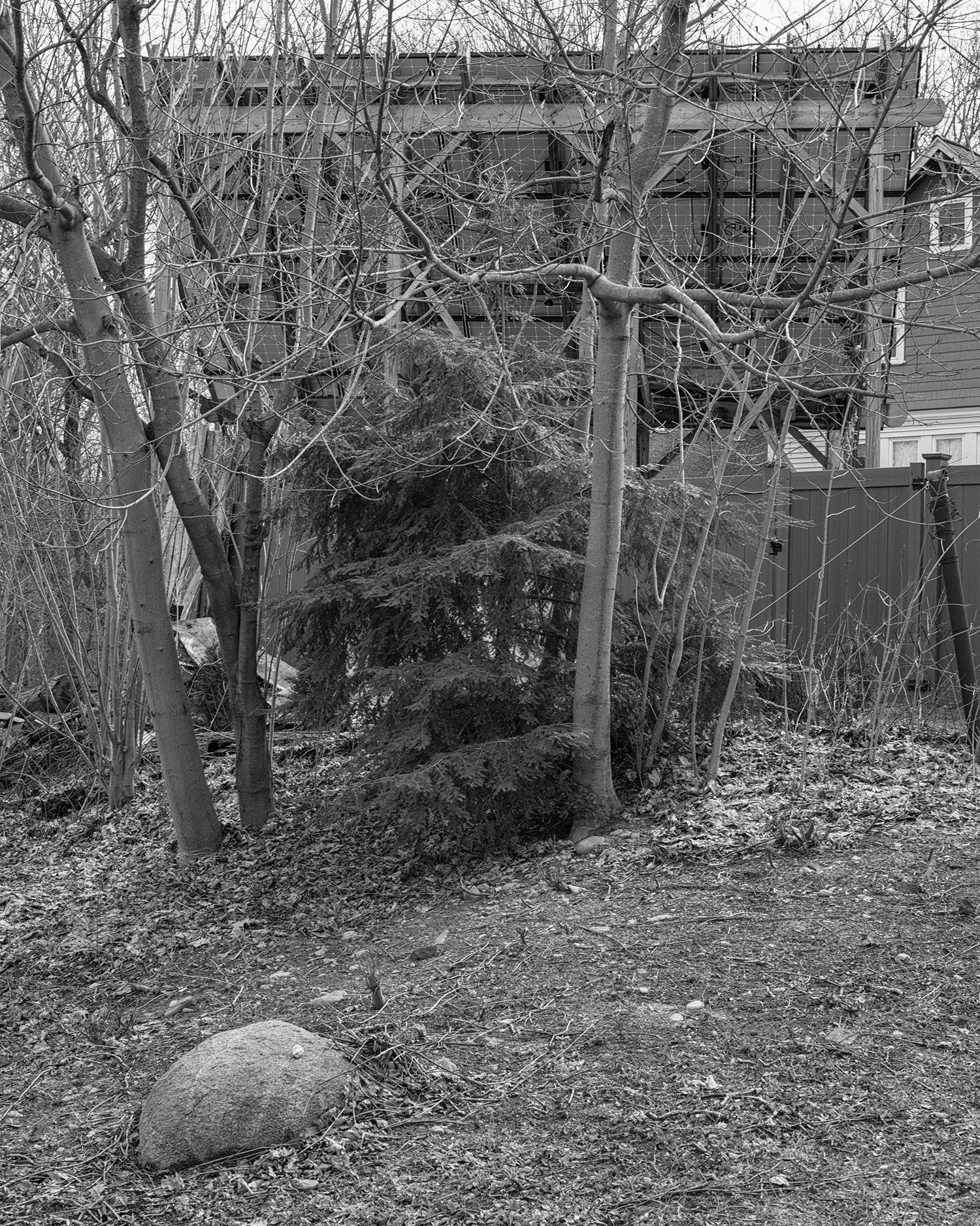
Formally, there's some structure. There's the rock in the foreground, a flat area of ground, a contrasting welter of tangled branches above that, and obscured behind the branches a oddly geometrical building with a sort of weird grid structure that both defies and echoes the tangle. There's the strong cross shape of horizontal branch across tree, which could either read as a reference to The Cross, or is just another echo of the grids on the building behind.
There's the blob of evergreen thing in the middle which, uh, fuck, I have no idea, but I could probably make up some formal bullshit about what it echos or balances, and there's some other shit around the edge.
So there's some sort of chaotic formal structure, I guess, all revealed in this sort of HDR-lite clinical detail, more like a blueprint than a photograph. Ok, I guess.
But ultimately who gives a shit? It's a clinical precision blueprint of some random crap.
How, really, is it different from these flat messes I shot with my phone while puzzling over this?


These things also have formal structure and a wilfully unappealing flatness, although I must admit I did not wait for a cloudy day and it was evening, so there's still a bit of drama that I could not drain out.
I'm certainly not claiming that someone ought to give me an MFA for these pictures. Indeed, I would probably attack anyone who attempted it.
But... what the hell is Jörg seeing in his picture that causes him to judge it a good picture? What, in particular, distinguishes it in his mind, as it surely must be distinguished, from any other potential picture of random shit taken on a cloudy day and murdered in Photoshop?
Why point the camera there with such satisfaction and not just, well, anywhere?
If we unwind time a bit, maybe we can trace this sort of thing back to the Bechers. The Düsseldorf school is certainly all over this kind of austere fuck-you look to their pictures, and often they seem to lean toward pictures of nothing.
The Bechers could absolutely answer the question of why point the camera that way instead of anywhere else? The answer was because there's a mine headframe there, and there isn't one in any of the other directions. It was not a complex algorithm, but one could make sense of it.
The result was, as we all know, a whole bunch of these austere, clinical, photos of mine headframes. Another year it would be grain elevators, and so on.
The same fuck-you aesthetic, more or less (they were not so allergic to blacks and whites, but the same sense is there), the same bland nothing subjects. The same sense that the viewer is being willfully cast adrift in a small boat to make their own way to land. With the Bechers, though, there was land to be found. The point is actually pretty obvious. Mine headframes are cool, they are interesting. It is interesting that they all look the same, and yet differ. They are interesting and in a way beautiful on their own.
Once one begins actually paddling, the land is not even hard to find.
It might be worth noting that the Bechers did series, not singletons. A single mine headframe, though more interesting that much of what we see from Mr. Colberg, would not be likely to make the point. 16 of them in a grid begins to make sense, though. Gursky doesn't do series, at least not famously, but sometimes he can make some sense even with his own take on much the same clinical aesthetic, but that's because he's very political and blunt. He's trying to make a point, rather than trying to avoid making a point.
With the others in the same vein, whether actually Düsseldorf or no, I don't feel like there's actually any land. It feels as if the artist has managed the aesthetic, and the pose of clinical detachment, has mastered the fuck-you, and the thrusting of viewers in to small boats, but has missed the point that there's supposed to be some land somewhere. Indeed, they seem to have developed the idea that there isn't supposed to be land. The viewer is supposed to, I guess, find something in the boat.
But if the point is to find something in the boat, if there is no land, then again, why this picture instead of that one? Why not point the camera any damn place? What makes this picture good?
Putting these things into books does not seem to help much. It's just bafflement on bafflement, although sometimes you do get a hint of boy, I hate Berlin.
Jörg seems to feel that there is some land someplace, but I am damned if I can find it, and I've been paddling this boat a while now.
I'd like to come up with some explanation that would at least be funny, but I'm at a loss.
ReplyDeleteThe photo looks a little more interesting on his site, and especially enlarged. Is that walnut (?) on the rock the point of it? Ah, "The nut on the stone".
The Bechers were documenting German vernacular industrial design of the 19th and 20th centuries as it was disappearing. You use the word clinical. Compare with Atget, or at least how Atget looks to us now; not so clinical. He was also recording his disappearing city.
In his wanderings does Jörg imagine himself an Atget recording the romantic back yards of his neighborhood?
Beats me, but then as you say there's clearly a Thing here, and Things tend to develop their own criteria of judgement. I think of, say, Death Metal... Why anyone "likes" it is baffling to me, and how they distinguish good from mediocre from bad within it is even more baffling.
ReplyDeleteAs people used to say: de gustibus non est disputandum... But where's the fun in that?
Mike
It's a straight up bad photo, pictorially and graphically dull AF. The one following it is better, or could be if the dull bit at the bottom was cropped out.
ReplyDeleteI just spent two minutes in GIMP on it, and I've got a picture that is easily 100x better than JC's raw/whatever original, the one he thought was "good" enough to publish in his newsletter.
ReplyDeleteSo it's not a great photo to begin with, but it at least has the potential to be hella better than what he made of it.
This assclown ain't got the digital chops.
I'm pretty sure he wants it to be just the way it is. Gonna guess that you punched the contrast and stretched those awful flat mids out, right?
DeleteI'm pretty sure he hasn't a fucking clue, and this is straight outta the camera.
Delete