I've been struggling to put this together for a while now, how to get from my angry
reaction to some sort of words on a page. Let's take a look at the fairly well
respected small press "Another Place Press".
Click anything.
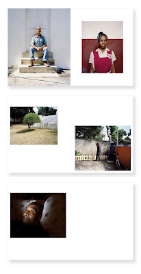
Here's a bunch of pages from a book by Andrew Jackson:
and another from Roei Greenberg:
but it doesn't matter, the whole product of the press is the same. How does Greenberg manage to make that photo
of a car look so utterly lifeless? I can't even tell you entirely how the effect is produced. The product of a great deal of Serious Art
Photography is the same. I've gone on at length about the
"I Hate Germany" genre, which is the same, but in
black and white.
It's tempting to say it's pictures of nothing, because it often is, but clearly it is more than that. There
are photographs of people here as well, there are photographs of objects and buildings of geopolitical import
or whatever. It's not all just trash bin and curbs in Berlin.
What ties all this together is the relentless, deliberate, lack of affect. This is absolutely mandatory, as far as
I can tell, in contemporary Serious Art Photography. You have to wring out any sense that anything in the picture
has any emotional import. You have to remove any sense of feeling. The result must be both utterly numb, and utterly
numbing.
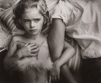
Compare with this:
Not only does the kid (that would be the mighty and all-powerful Jessie Mann there) have some affect, there's a whole terrible
story present in the frame if you're willing to look. There is import here, albeit of a small scale.
It's tempting to say that the affectless modern work is trivially easy to produce (and often it is,
Deutscher Gefälschterstiermist was not very difficult) but a lot
of these things, the wrung-out, dead eyed pictures of people, these have to take some sort of effort? I don't even know
how to direct someone to look that flat, that numb. There's a branch of "female gaze" photography that specializes
in this sort of look, posing women (usually some particularly oppressed population of women) with a 1000-yard stare to symbolize
their oppression, but you can tell that it's a batch of women that would rather be and usually are laughing together.
Some of it is simply that "mom's taking a photo now look serious" look that children are forced in to at Disneyland by
particularly relentless mothers with cameras, or at least were in the 1970s. You can do it, by simply being savage with
your subjects, I guess. Make them ill-at ease and lost as to what they're supposed to be doing, and they'll shut down
to a sort of still, nervous and yet affectless, mood, perhaps.
I suspect that producing a complete and coherent body of work with a core that is so thoroughly dead requires its own set of
talents.
I hate it. I hate it. Not the pictures one by one, some of which are merely dull. I hate the giant portfolios
full of these corpses of photos, these numb, dead things, that people are making over and over and over, on
purpose.


What terrible story? The kid is a biter with war paint and a feather boa on. Cool, right? I don't know the story, maybe it is terrible. If so, the picture doesn't reveal any of its terribleness, and it doesn't make me want to know (also it looks theatrical, but maybe that's a kid thing).
ReplyDeleteProjection is one of the few things about photography that stir people up, and it generally won't work on random viewers because they have to be literally told what 'the story' is, in order to form a projection.
The "terrible story" is just that Jessie bit the shit out of someone. Which is pretty terrible if you've ever been bit, but I admit isn't exactly geopolitically weighty.
DeleteShe does look feral!
DeleteA cynic might say that hating the stuff these kids are into these days (I'm hearing my late father scoffing at Top of the Pops on TV) is a sure sign of advancing age...
ReplyDeleteI, too, dislike the affectless style, but I suspect so, too, do most people not invested in the MFA aesthetic i.e. pretty much everybody. I think its original main message was "this is just a photograph, nothing fancy or pretentious", which was kinda sorta interesting for about ten minutes, but it has gone on to become the style required to get past the gatekeepers. But how many copies do such books sell?
OTOH I find a photo like the Sally Mann has too much "affect" for my taste. I know it's not cool to find work like that disturbing, not least hers, but I do: there's something about a certain style of ultra-liberal child-rearing that brings out my inner puritan, especially when so pains-takingly documented. But then decomposing corpses creep me out, too.
Mike
There is an awful lot of affect there ;)
DeleteIt may help to know that there's also quite a bit of playacting involved, but you can't know that a priori and maybe it's irrelevant anyway.
You didn't raise your kids to be essentially feral? I've seen pictures of you! When did you buckle under to The Man!?!!
"Jessie, before I return you to your cage in the basement, please pose with the victim for mommy. What? No, I said mommy, not money."
Delete(FWIW, I consider Mann to be a very cool and interesting artist, whose methods have occasionally raised eyebrows. Are her grown children in therapy?)
When it comes to my kids, I AM the Man! (or was... They have seen through me now...) But no biting around here, thank you very much!
DeleteMiike
Mike C asked: 'But how many copies do such books sell?' Far fewer than get printed it seems, most end up in boxes under the bed or propping up wonky tables. One study (https://tinyurl.com/5n7cj79c) suggests that 85% of them are bought by photographers themselves. Authors often make major contributions to publishing costs. So I guess we're all buying each other's books
ReplyDeleteIt's very much a vanity press thing. The other 15% are probably bought by celebrities' fans (celebrities running a photo book side hustle, for which there's a solid marketing angle -- Bryan Adams, Linda Eastman, Patti Smith, their name is legion).
DeleteThe example images at the top to me all have the property of “single things isolated in the middle of the frame with a neutral/blank countenance”. Maybe that’s the easy formula for success?!
ReplyDeleteOh, let's all have a smug-n-superior pile in...
ReplyDeleteHave any of you commenters even looked at the Another Place Press web site?
I actually think that APP is a pretty commendable undertaking, giving both a channel for photographers to get published and a low price entry point for interested people to acquire nicely produced photo books. Calling it a "Vanity Press" is just lazy. I doubt it is making a lot of money.
There is A LOT of variety in AAP's catalog, and I don't think that Iain Sarjeant, who basically is APP, has a lot to do with the MFA thing (largely a North American academic circle jerk as far as I can tell). Oh, and most of their titles sell out fast.
I've bought and enjoyed quite a few APP books. Some are outstanding, such as "Icebreaker" by Mark Power, or Jessica Backhaus's "Far Away But Close". Some I'm personally not interested in. From the above two, I don't much personally like the Jackson photos, but the Greenberg ones have a lucidity about them that personally I like. Andrew maybe you prefer Instagram-Velvia-Radioactive landscape stuff... who can tell, all you're saying is you prefer Sally Mann. I think we've got that by now. Perhaps you can give some examples of work similar to Greenberg's that you actually do like, or are you just enjoying being negative?
Personally I'm sick and tired of everything being compared to Sally Feckin' Mann. She's not the Messiah. Just similarly massively over-rated.
I believe David's remark re: vanity press was aimed at the larger industry, rather than specifically at APP which more or less famously isn't a vanity press at all. They actually sell things and pay the artists, I think?
DeleteAlso, it is true that in some sense there is a wide variety to Iain's selections, but come on. Go to to their front page and have a quick scroll. There absolutely is a lot of variety there, but zero affect in *any* of it. It might hit you as "well, that's just photography" but it leaps off the page at me as "no, this is modern numbing bullshit." Iain seems to be a genuinely fine fellow and everyone loves his work, and you're perfectly welcome to love him and his work too.
I don't love the work. I disagree with this entire direction in photography. Yes, if you want to "make it" you better get on board, because this is the only train in the station, but I hate it.
Now, since you seem to suffer so much pain from reading my little set of notes here, might I gently suggest that you find something else to read?
"Vanity press" simply means you pay someone to publish your book, as opposed to the other way around. Regardless of its merits (and the category definitely includes many fine projects), the publisher has zero confidence of recouping an investment in it. Make of that what you will.
DeleteIn some part, photography reflects what people see in their surroundings. Maybe some are bored (or never liked) the bland boring urban decay meme, but it might mean a lot to some people who have been surrounded by it since birth and never had the opportunity to see anything else.
ReplyDelete