A friend gave me this for my birthday, and I was excited to see it. I remain excited, merely to possess it. It's really good; as a bonus it's
a book one can return to briefly or at length, forever.
What is it?
Well. It's a book of days, innit? There is (with a couple exceptions) one page per day of the year (including Feb 29) and on each page
there is a fairly small photo and under that is a line or two of text written by Patti Smith. It's a kind of an almanac, but of
the day to day minutiae of the life of Patti Smith. It happens that Patti Smith has lived a startlingly interesting life, but I don't
that actually matters. Anyone could do this, and if they did it well (a large "if") it would prove equally interesting. At least close.
The details vary from day to day. Often it's just some little still life that someone, presumably Smith, put together and photographed.
There may or may not be any real connection to the day, although often there is. It's someone's birth or death day, and there's a snapshot
of so-and-so, or a snapshot of their grave, or the cover of a book they wrote, or a book which is about them. Occasionally there is a salient
event. Often there is only a musing on something seasonal, or perhaps not even seasonal.
There might be a little still life containing a pocket knife, and underneath something written about Sam Shepherd, the fact that this
was his knife, and perhaps a birthday wish for Sam (departed some years now, but a good friend, sometime lover, and long time collaborator
of Smith's.) There might be a still life with a stick and a coffee cup, and a remark about the value of friendship. Perhaps it's a snapshot
of Smith with some people, the text merely describes who those people are and what they meant to her.
I love it because it is essentially humble. Yes, Smith knew everyone who was anyone and has a snapshot of most of them, but we're not
supposed to be sighing at how well she knew Mapplethorpe, we're supposed to see Mapplethorpe as just a guy who hung around with this
chick who had a band and sometimes made a lot of noise at CBGB when it was cool to do that, and even when it wasn't any more. The
photos are often just snaps, and even the best of them are well made still lifes of a certain ordinary sort. Just a desk with
an artful clutter, or whatever.
The text is never overwrought. Wistful, funny, to the point, factual, a little philosophical in very small doses, and so on. Never
too long or particularly complicated. Just a note. A sequence of little bits and pieces, laid out with some care by someone who's pretty
good at this sort of thing. She didn't know all these people, she only met Jim Morrison once. She's fond of his work, and of the poems
of this guy and the paintings of so-and-so, and so on. It's a sort of patchwork quilt of crap Smith thought was worth putting into a patchwork
quilt.
I read it front to back, but having done that now it's a book I can turn to today's date and spend 2 or 5 seconds reading and looking at
it, and that's all it asks of me for today. I can turn forward or backward from today, and spend 10 minutes, if I like.
I have the hardcover, there might be a paperback I suppose, but I don't know. It's a small, fat, book, well made, easy to hold and read. Highly recommended!
Tuesday, February 28, 2023
Friday, February 10, 2023
Something to Look At
Here's a recent press photo.
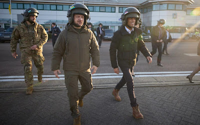
We got a couple guys striding along in what are arguably humorously large helmets, one looking fairly serious and filling out his clothes because he's a stocky dude, and another dude not-quite smiling and being, well, kinda skinny and goofy looking. The men are, of course, Volodymyr Zelensky and Rishi Sunak, the leaders of Ukraine and Britain respectively. The obvious reference to the film "Spaceballs" has been made a bunch of times.
This photo (well, a crop of it focusing on the two men) is Doing The Rounds as the kids say, and generally the consensus is that while Zelensky looks like a big stud and is fully legit in his giant hat, Sunak just looks like an opportunistic idiot.
This is interesting to me, because the dudes literally look the same, apart from their body shapes which, I am reliably informed, we're not supposed to shame people for. Same demeanour (Sunak is showing some teeth, but not really smiling, Zelensky has the same slight humor vibe but without teeth) same posture, same stride, etc etc. The point, though, is that Zelensky is a good guy and Sunak is a bad guy.
They're wearing, I am informed, pretty ordinary aviation helmets. Everyone kind of looks like an idiot in those things, especially with the visor up which is why they look Extremely Huge. I assume that they were told to don the helmets, because you don't get into a military helicopter without a helmet, but maybe not. Either way, though, it's totally a photo-op. They're both trying to look military as hell and so on, doing the buddy-film "serious but with good humor" vibe, because the newspaper tog is standing right there and they're both pretty accomplished politicians. They're probably both thinking "I feel the need... the need for speed!" or possibly ".. talk to me Goose .." right now.
The contortions people are going through to argue that Zelensky is awesome and Sunak is a dipshit are pretty funny, and also illustrative. There is nothing visible in the frame that supports this interpretation. People are simply projecting their preferences onto the picture, and then the more self-aware ones are scrabbling around for some support. All the come up with is essentially that Sunak has a small head, which, see above.
To be honest, a lot of people are essentially taking as given that Sunak looks dumb and Zelensky awesome. It's Just Obvious.
Except that it's not.
I've hammered this point a few times before, the fact that we read a photo of a politician based largely on our politics, and not on anything in the photo. So-and-so "just looks sneaky" when in fact he looks utterly bland, and the other guy looks "statesmanlike" when in fact etc. Whatever. This is the first case I've seen where we have two figures at opposite ends of the "like" spectrum in the same photo, in the same posture, doing the same things.
The polarization in reading remains as clear as ever.
Thanks to Andy B. (name elided to protect the innocent from my bad reputation) for consulting on wtf those helmets actually are and what's probably going on
Tuesday, February 7, 2023
Art and Emotion
I was reading Wittgenstein (lawks! He's so fancy!!) by which I mean violently, numbly, clubbing my way
through a short book of his notes recently. He made what struck me as an interesting observation. To be fair
he made more than one, but this is the one I want to address.
We commonly attempt to explain the value of music specifically, and Art generally, in terms of its ability to evoke emotion. The value of Beethoven's 9th is how it makes us feel this way and that way as we listen to the various movements and themes and odds and ends flowing by. Similarly, the value of a Monet is to be located in, or at least next to, the emotional response it evokes. The fact that it looks a bit like a lot of water-lilies might be pointed out, but honestly doing so would mark you as a bit of a dunce.
Wittgenstein's point, if I understood it correctly, could be expanded to something like this: what if someone invented a pill, or an injection, or even piece of gum (pace Roald Dahl) which induced precisely the same sequence of emotional response as Beethoven's 9th symphony. Perhaps even, by some chemical witchcraft, it tailored the sequence to you, in your current emotional state, accurately recreating what you at this exact moment would feel if you were in the concert hall?
In no way would we consider the pill, injection, or gum to be an adequate replacement for the symphony.
Ok, maybe some fringe weirdos would, but they probably drink Soylent and take a lot of Adderall because they think it makes them smart. But the majority of normal humans would stare at you if you proposed this equivalence. Of course the pill isn't the same thing as the symphony. No, no matter how accurately it recreated the emotional roller coaster. No. And yet, this is supposedly the value of the thing, isn't it?
This is the obsession Wittgenstein is working through in these notes (The Blue and Brown Books.) He's interested in the idea that many things have symbolic content, many things signify something, but it seems that they always leave something. The emotional content of Beethoven is real and important, but there is something else, there is more. There is, in fact, something essential which is not described by the emotion, or by the musical notation, or an analysis of the harmonic progression, or the repetition of themes, or anything else.
Any attempt to carve away superfluity, or conversely to surgically locate an essential core, will inevitably fail. We recognize it as failure the moment we even pose the question. "Of course that won't work, of course there's something else there" even when, perhaps especially when, we seem to have analytically removed the entirety of the thing.
The only reason we accept the idea that emotional response is really the thing, when it comes to Art, is because we're not thinking about it very hard. I have certainly accepted it, and probably even said it, but it's clearly wrong if you think about it in terms of Willy Wonka's gum and the sad sad fate of Violet Beauregarde.
I haven't got any answers here. Monet's water lilies are more than the emotional response they induce, and also they're more than swooshes of paint on canvas, and they're more than representation of water and flowers. I can't tell you, tbough, what they actually are. Just... not that. At least, not merely that.
Wednesday, February 1, 2023
Hazy Skies and Science
I will open strong, with not one but two separate disclaimers.
In primis this is an off-topic post. I will be mentioning art, but not photography.
Secundus I am not a climate change denier, not even slightly. This is not really salient, but a hostile read of the sequel might produce that impression.
There is an article from the Washington Post doing the rounds among the usual enthusiastic idiots. If you can get around the paywall, it's here. It's a breezy newsy report on a scientific paper which I will get to shortly.
Let us begin by briefly summarizing the content of both the news item and the underlying paper. A couple of climate scientists went and looked at some paintings by Monet and Turner, and used more or less standard mechanisms to quantify how "hazy" the atmosphere in the paintings was. It's pretty well established, I guess, that both of these painters leaned more and more toward softly diffused distance over certain periods of their careers. The far-off material in the paintings grew steadily fuzzier over the years.
The scientists also modeled how much air pollution there might have been in London and Paris specifically over those same years, using, I think, coal consumption estimates as a proxy for atmospheric sulfur dioxide levels.
So they had two mathematical models for things we already know: Monet/Turner paintings got fuzzier over time, and smog in London and later Paris increased over the same intervals. Then they applied statistical methods and determined that, lo, the two models were correlated to a moderate degree. The term of art is "61% explained variance" which is a technical term I don't really understand and frankly don't care to. It seems to mean "pretty good but not great correlation."
This is the technical meat of it. Onwards. Let me now dispose of the WaPo piece.
The WaPo piece does manage to summarize the gist of the paper, but fumbles two things. The first is that the "explained variance" is written up thus:
which, well, I don't really grok "explained variance" but I'm pretty sure this isn't it. This sounds a lot like a little more than half the time, the paintings got fuzzier along with the air but that's definitely not what it means. That would be an absolutely shit metric anyway. Imagine, if you will, half the time, the painting's contrast decreased as sulfur dioxide went up, and half the time it increased. That is a description of complete randomness. Whatever "explained variance" means I am pretty sure it's better than that.
The second howler in the WaPo piece is that the author promoted Whistler to an Impressionist which is just wrong. This is one of these weird things where the columnist decided to just add some random shit in for no reason at all. The remaining problems in the WaPo piece are inherited from the underlying paper, which you can read here if you like.
The paper seems to be essentially confused about what its point is, and as a completely separate note is more or less nakedly p-hacking.
If you read anything from the paper itself, I suggest the Conclusions section. The authors seem to be unclear on whether they are using the paintings (treated as in some essentials "realistic") to support evidence of visible smog, or whether they are assuming the reality of the smog, in which case their study suggests that Monet and Turner were more "realistic" painters than supposed. What are we assuming, and what are we deducing from our assumptions?
The answer is, of course, nothing. They've confirmed a loose statistical correlation which we already kind of knew intuitively, but they are unable to deduce anything from it. It's just.. there. The conclusion is just a haphazard attempt to justify a lot of screwing around with measurements and statistics that didn't actually lead to much of anything. I assume the screwing around is top-notch, I didn't check it but it looked complicated and very science-y. It doesn't matter how good the screwing around is, since it doesn't lead anywhere.
Which segues neatly to the p-hacking. What's p-hacking? Well, lemme tell you:
In a lot of science you make some observations, and then you calculate that if things were random you'd only expect to see this particular set of observations 1 time in 20, or 1 time in 100. Thus, the fact that you observed it the first and only time you made them is evidence that things are in fact not random. p-hacking is when you run the experiment 50 times or 100 times or whatever, and throw away all the ones that didn't give you the result you were looking for.
In this case, the authors were looking for painters who were making paintings that depicted hazier and hazier air over roughly the right intervals, and they found a couple of them. They probably didn't actually run the experiments with Cézanne, but there's a reason they picked Monet and Turner.
This is, essentially, why the paper is confused. The authors were looking for (and this is pretty clear if you even skim the paper as a whole) evidence of air pollution in paintings. They explicitly got into this study hoping to show that you can literally see increasing air pollution across bodies of painted work. This is a profoundly dumb idea, for pretty obvious reasons. So they inevitably landed on a couple of painters that supported their hypothesis, because the other ones were no good for their purpose. Since painters don't actually work that way they wind up partially re-tasking all their science-y hacking around to argue "Monet and Turner were actually realistic painters" but not very convincingly.
You can run a correlation either way, cause and effect, or effect and cause, but you do need to pick a direction.
There is a more basic problem here, because of the way painters do actually work. What the paper's model of air quality aims to show is that, on average, the atmosphere got hazier. That is, if over the relevant interval you'd gone out and randomly sampled the air now and then, on average in some meaningful way you'd see a rise in haziness. On this day it might be perfectly clear, on another hardly breathable; the average haziness week-on-week or year-on-year or something would on the other hand steadily go up.
The trouble is that Monet and Turner were not sampling things at random! They were painting the looks that they preferred, on the days those looks showed up. Both the WaPo piece and the paper quote Monet going on at some length to the effect that he wants as much fog as possible. He is, according to evidence quoted in the actual paper, definitely not painting when the air is clear. This is the opposite of random.
In order for the argument to make any sort of sense, you have to somehow argue that Monet and Turner were depicting "typical" atmosphere or something like that, which while possible is a bit of a stretch. See the Monet quote, in which he implies the opposite. It's entirely possible that they both leaned in, completely by accident, harder and harder to hazier air (which is fun to paint, and which really makes distant things look distant!) at the same time the air actually did get hazier. All the painters that were not leaning in to hazier but instead found the increasing smog frustrating are conveniently left out of the study.
This paper is pretty obviously the kind of interdisciplinary work where the authors are hoping that each side thinks the meat must be on the other side. As long as the climate scientists think it's an art history paper, and the art historians think it's a climate science paper, all is well.
In primis this is an off-topic post. I will be mentioning art, but not photography.
Secundus I am not a climate change denier, not even slightly. This is not really salient, but a hostile read of the sequel might produce that impression.
There is an article from the Washington Post doing the rounds among the usual enthusiastic idiots. If you can get around the paywall, it's here. It's a breezy newsy report on a scientific paper which I will get to shortly.
Let us begin by briefly summarizing the content of both the news item and the underlying paper. A couple of climate scientists went and looked at some paintings by Monet and Turner, and used more or less standard mechanisms to quantify how "hazy" the atmosphere in the paintings was. It's pretty well established, I guess, that both of these painters leaned more and more toward softly diffused distance over certain periods of their careers. The far-off material in the paintings grew steadily fuzzier over the years.
The scientists also modeled how much air pollution there might have been in London and Paris specifically over those same years, using, I think, coal consumption estimates as a proxy for atmospheric sulfur dioxide levels.
So they had two mathematical models for things we already know: Monet/Turner paintings got fuzzier over time, and smog in London and later Paris increased over the same intervals. Then they applied statistical methods and determined that, lo, the two models were correlated to a moderate degree. The term of art is "61% explained variance" which is a technical term I don't really understand and frankly don't care to. It seems to mean "pretty good but not great correlation."
This is the technical meat of it. Onwards. Let me now dispose of the WaPo piece.
The WaPo piece does manage to summarize the gist of the paper, but fumbles two things. The first is that the "explained variance" is written up thus:
... 61 percent of the contrast changes in the paintings
largely tracked with increasing sulfur dioxide concentrations during that time period.
which, well, I don't really grok "explained variance" but I'm pretty sure this isn't it. This sounds a lot like a little more than half the time, the paintings got fuzzier along with the air but that's definitely not what it means. That would be an absolutely shit metric anyway. Imagine, if you will, half the time, the painting's contrast decreased as sulfur dioxide went up, and half the time it increased. That is a description of complete randomness. Whatever "explained variance" means I am pretty sure it's better than that.
The second howler in the WaPo piece is that the author promoted Whistler to an Impressionist which is just wrong. This is one of these weird things where the columnist decided to just add some random shit in for no reason at all. The remaining problems in the WaPo piece are inherited from the underlying paper, which you can read here if you like.
The paper seems to be essentially confused about what its point is, and as a completely separate note is more or less nakedly p-hacking.
If you read anything from the paper itself, I suggest the Conclusions section. The authors seem to be unclear on whether they are using the paintings (treated as in some essentials "realistic") to support evidence of visible smog, or whether they are assuming the reality of the smog, in which case their study suggests that Monet and Turner were more "realistic" painters than supposed. What are we assuming, and what are we deducing from our assumptions?
The answer is, of course, nothing. They've confirmed a loose statistical correlation which we already kind of knew intuitively, but they are unable to deduce anything from it. It's just.. there. The conclusion is just a haphazard attempt to justify a lot of screwing around with measurements and statistics that didn't actually lead to much of anything. I assume the screwing around is top-notch, I didn't check it but it looked complicated and very science-y. It doesn't matter how good the screwing around is, since it doesn't lead anywhere.
Which segues neatly to the p-hacking. What's p-hacking? Well, lemme tell you:
In a lot of science you make some observations, and then you calculate that if things were random you'd only expect to see this particular set of observations 1 time in 20, or 1 time in 100. Thus, the fact that you observed it the first and only time you made them is evidence that things are in fact not random. p-hacking is when you run the experiment 50 times or 100 times or whatever, and throw away all the ones that didn't give you the result you were looking for.
In this case, the authors were looking for painters who were making paintings that depicted hazier and hazier air over roughly the right intervals, and they found a couple of them. They probably didn't actually run the experiments with Cézanne, but there's a reason they picked Monet and Turner.
This is, essentially, why the paper is confused. The authors were looking for (and this is pretty clear if you even skim the paper as a whole) evidence of air pollution in paintings. They explicitly got into this study hoping to show that you can literally see increasing air pollution across bodies of painted work. This is a profoundly dumb idea, for pretty obvious reasons. So they inevitably landed on a couple of painters that supported their hypothesis, because the other ones were no good for their purpose. Since painters don't actually work that way they wind up partially re-tasking all their science-y hacking around to argue "Monet and Turner were actually realistic painters" but not very convincingly.
You can run a correlation either way, cause and effect, or effect and cause, but you do need to pick a direction.
There is a more basic problem here, because of the way painters do actually work. What the paper's model of air quality aims to show is that, on average, the atmosphere got hazier. That is, if over the relevant interval you'd gone out and randomly sampled the air now and then, on average in some meaningful way you'd see a rise in haziness. On this day it might be perfectly clear, on another hardly breathable; the average haziness week-on-week or year-on-year or something would on the other hand steadily go up.
The trouble is that Monet and Turner were not sampling things at random! They were painting the looks that they preferred, on the days those looks showed up. Both the WaPo piece and the paper quote Monet going on at some length to the effect that he wants as much fog as possible. He is, according to evidence quoted in the actual paper, definitely not painting when the air is clear. This is the opposite of random.
In order for the argument to make any sort of sense, you have to somehow argue that Monet and Turner were depicting "typical" atmosphere or something like that, which while possible is a bit of a stretch. See the Monet quote, in which he implies the opposite. It's entirely possible that they both leaned in, completely by accident, harder and harder to hazier air (which is fun to paint, and which really makes distant things look distant!) at the same time the air actually did get hazier. All the painters that were not leaning in to hazier but instead found the increasing smog frustrating are conveniently left out of the study.
This paper is pretty obviously the kind of interdisciplinary work where the authors are hoping that each side thinks the meat must be on the other side. As long as the climate scientists think it's an art history paper, and the art historians think it's a climate science paper, all is well.
Subscribe to:
Posts (Atom)