I've been struggling to put this together for a while now, how to get from my angry
reaction to some sort of words on a page. Let's take a look at the fairly well
respected small press "Another Place Press".
Click anything.
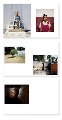
Here's a bunch of pages from a book by Andrew Jackson:
and another from Roei Greenberg:
but it doesn't matter, the whole product of the press is the same. How does Greenberg manage to make that photo
of a car look so utterly lifeless? I can't even tell you entirely how the effect is produced. The product of a great deal of Serious Art
Photography is the same. I've gone on at length about the
"I Hate Germany" genre, which is the same, but in
black and white.
It's tempting to say it's pictures of nothing, because it often is, but clearly it is more than that. There
are photographs of people here as well, there are photographs of objects and buildings of geopolitical import
or whatever. It's not all just trash bin and curbs in Berlin.
What ties all this together is the relentless, deliberate, lack of affect. This is absolutely mandatory, as far as
I can tell, in contemporary Serious Art Photography. You have to wring out any sense that anything in the picture
has any emotional import. You have to remove any sense of feeling. The result must be both utterly numb, and utterly
numbing.
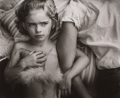
Compare with this:
Not only does the kid (that would be the mighty and all-powerful Jessie Mann there) have some affect, there's a whole terrible
story present in the frame if you're willing to look. There is import here, albeit of a small scale.
It's tempting to say that the affectless modern work is trivially easy to produce (and often it is,
Deutscher Gefälschterstiermist was not very difficult) but a lot
of these things, the wrung-out, dead eyed pictures of people, these have to take some sort of effort? I don't even know
how to direct someone to look that flat, that numb. There's a branch of "female gaze" photography that specializes
in this sort of look, posing women (usually some particularly oppressed population of women) with a 1000-yard stare to symbolize
their oppression, but you can tell that it's a batch of women that would rather be and usually are laughing together.
Some of it is simply that "mom's taking a photo now look serious" look that children are forced in to at Disneyland by
particularly relentless mothers with cameras, or at least were in the 1970s. You can do it, by simply being savage with
your subjects, I guess. Make them ill-at ease and lost as to what they're supposed to be doing, and they'll shut down
to a sort of still, nervous and yet affectless, mood, perhaps.
I suspect that producing a complete and coherent body of work with a core that is so thoroughly dead requires its own set of
talents.
I hate it. I hate it. Not the pictures one by one, some of which are merely dull. I hate the giant portfolios
full of these corpses of photos, these numb, dead things, that people are making over and over and over, on
purpose.
Wednesday, March 29, 2023
Sunday, March 19, 2023
The World's Largest Photograph
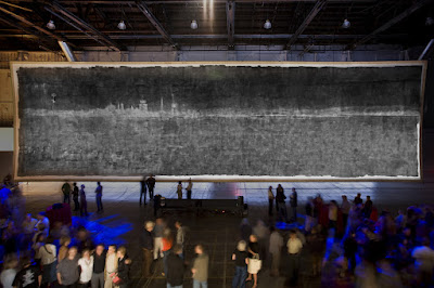
Apparently, in 2006, some dudes made the world's largest photograph using the world's largest camera.
To be exact, the blacked out the inside of an abandoned aircraft hanger and knocked a small hole in one door to create a camera obscura. Then they used umpty-billion gallons of liquid emulsion to sloppily sensitize an enormous piece of canvas, and the blabbity million gallons of developer, and wubbity billion gallons of fixer delivered with firehoses and blah blah blah and now there's this immense fucking thing.
The hole, we learn, was Precision Machined from a Thin Sheet of Titanium which just made me roll my eyes. They could have just driven a nail through the door, it wouldn't have made a damn bit of difference. There is in general a lot of blather about the technical challenges but honestly this sort of thing is a logistics problem, not a photography problem. The photography problems are all trivial.
The photo, on the one hand, is kind of cool. It's technically just terrible, because they seem to have literally just used paint rollers to apply emulsion to it's all uneven and you can see the "brushwork" clearly. The subject is, naturally, just whatever happened to be outside the door so it's some runways and a control tower.
On the other hand, what the hell? Who cares? It's basically just the world's largest ball of string, an object interesting literally only because of its size and uniqueness. The pictures I have seen of it suggest that the quality is actually so low it does not even really read as a photograph. It's just a sort of set of blotches and splashes, as if Jackson Pollock had started out trying to paint an airport for a bit before the amphetamines kicked in, but he only had grey paint.
It does not seem to function as a photograph. There is no sense of presence, no visceral reaction as-if you were.. at some airport. This is probably made worse by the fact that it is, for obvious reasons, a negative. So.. it's a giant fuzzy blotchy negative of an abandoned airport. At least they seem to have turned it right-side up. It seems, essentially, to be the sedimentary remains of a performance art piece, in which legions of volunteers were recruited to to a bunch of pretty tedious labor.
Seriously, look at this thing. Who gives a shit?
I suppose it's inevitable that the photography press will, from time to time, drag this stupid dog out and write it up for slow news days, but really, what the hell?
Monday, March 13, 2023
Course Design
Some chappie on twitter, one Charles W McKinney, Jr., asked this question:
and that tickled me, so I thought I'd write it up. Long-time readers will find some redundancy, because I'd like this little essaylet to be standalone. It's been a while since I've done any teaching, but I have spent some time standing in front of a batch of students, so I'm not completely inventing stuff here.
This is exactly the sort of overwrought plan I always got myself in trouble with when I was teaching, but since this is hypothetical, I am (more or less) safe from the consequences.
I'd begin with one photo per week. Possibly skipping week one. Photos should be on-topic, visually rich, and ideally point in a fairly straughtforward way toward some sort of week-relevant theme. Weekly themes would ideally tie together as indicated below. The course could be on pretty much anything, although I probably wouldn't try to teach math this way.
The first week might usefully be an introductory week and proceed differently, but in general each week would proceed in this way:
Begin with a photo, and something on the order of an hour of careful forensic analysis of it. The photo should be amenable to such digging, hence the "visually rich" remark above. A well-chosen photo will contain many discernible facts, and the goal of the forensic analysis is to enumerate and elaborate on those visible facts. If the format is seminar-like, the professor should have useful answers for questions regarding discernible facts: "what does such and such an acronym refer to?" and so on, playing the role of a research library as students explore the picture and assemble facts. If it's more of a lecture, the professor does essentially all the fact-finding, enumeration, and elaboration.
At the end of the process, a large number of facts have been enumerated. "A person is holding a sign, which says such and such, which refers to such and such, which is probably part of a larger protest about such and such" and so on. Ideally a great deal of information about the 5 W's has been assembled and organized. Probably light on "Why?" of course.
The remainder of the week's efforts then focus on developing the context and implications of these facts. Something is going on in the picture. How does that fit into a larger situation? What can we say about the larger situation, referring back frequently to the picture. Are there other pictures than can be introduced? And so on. Glibly: the "Why?" is explored in detail.
Ideally each week's material flows into the next weeks in a coherent way, providing a semester-long flow of material that coheres into a body of knowledge.
The purpose of the picture is first of all a point of interest, something "fun" to anchor on, but also, ultimately, to reify the material we're supposed to be learning/teaching.
Long-time readers will likely recognize this as essentially a rearrangement of my standard approach to photo criticism, pointing it in the direction of general teaching rather than as a critical method.
Professors - a question:
What would it look like to put together a course based on photos? For instance: 10 photos on urban black life. Then, using the photos as a base, build the syllabus from there. Have ya'll done this before? Thoughts? How would you do it?
What would it look like to put together a course based on photos? For instance: 10 photos on urban black life. Then, using the photos as a base, build the syllabus from there. Have ya'll done this before? Thoughts? How would you do it?
and that tickled me, so I thought I'd write it up. Long-time readers will find some redundancy, because I'd like this little essaylet to be standalone. It's been a while since I've done any teaching, but I have spent some time standing in front of a batch of students, so I'm not completely inventing stuff here.
This is exactly the sort of overwrought plan I always got myself in trouble with when I was teaching, but since this is hypothetical, I am (more or less) safe from the consequences.
I'd begin with one photo per week. Possibly skipping week one. Photos should be on-topic, visually rich, and ideally point in a fairly straughtforward way toward some sort of week-relevant theme. Weekly themes would ideally tie together as indicated below. The course could be on pretty much anything, although I probably wouldn't try to teach math this way.
The first week might usefully be an introductory week and proceed differently, but in general each week would proceed in this way:
Begin with a photo, and something on the order of an hour of careful forensic analysis of it. The photo should be amenable to such digging, hence the "visually rich" remark above. A well-chosen photo will contain many discernible facts, and the goal of the forensic analysis is to enumerate and elaborate on those visible facts. If the format is seminar-like, the professor should have useful answers for questions regarding discernible facts: "what does such and such an acronym refer to?" and so on, playing the role of a research library as students explore the picture and assemble facts. If it's more of a lecture, the professor does essentially all the fact-finding, enumeration, and elaboration.
At the end of the process, a large number of facts have been enumerated. "A person is holding a sign, which says such and such, which refers to such and such, which is probably part of a larger protest about such and such" and so on. Ideally a great deal of information about the 5 W's has been assembled and organized. Probably light on "Why?" of course.
The remainder of the week's efforts then focus on developing the context and implications of these facts. Something is going on in the picture. How does that fit into a larger situation? What can we say about the larger situation, referring back frequently to the picture. Are there other pictures than can be introduced? And so on. Glibly: the "Why?" is explored in detail.
Ideally each week's material flows into the next weeks in a coherent way, providing a semester-long flow of material that coheres into a body of knowledge.
The purpose of the picture is first of all a point of interest, something "fun" to anchor on, but also, ultimately, to reify the material we're supposed to be learning/teaching.
Long-time readers will likely recognize this as essentially a rearrangement of my standard approach to photo criticism, pointing it in the direction of general teaching rather than as a critical method.
Subscribe to:
Posts (Atom)


