This is a theme I revisit occasionally, because I am very, very interested in how pictures of
people function. Very long time readers may find large swathes of this familiar, but I believe I have
something new to add this time around.
This much is so sufficiently established by wiser heads than mine that we might as well take it,
in broad strokes, as fact:
We, humans, are mind-readers. When we are interacting with another human, we maintain a surprisingly
accurate and detailed model of the other human's mental state. It goes beyond simple mood, and includes
rough approximations of what the other human is thinking, and where, in some detail "their head is at."
We guess at how a joke would be taken, whether she would like us to kiss her, and so on. We're wrong
some of the time, but right surprisingly often. Our social systems are grounded in these mechanisms.
Two things: First, our mental model is built by continuous observation of body language and facial
expression, in concert with how the conversation is going. We use a myriad of thoroughly subtle cues,
I don't know the extent to which they're catalogued, but the catalog is deep. Second: we are over-confident in the correctness of our mental model.
How often do we encounter the "hey, but you wanted me to..." which is some combination of
wishful thinking and misread cues? At least in those cases in which you did not actually want them
to, but are now denying it.
Thus endeth the science lesson. Onwards now to speculation from your host.
Even somewhat less long-term readers will have seen my theory about presence, the idea that a photograph
conjures a kind of presence. The idea is that when we look at a photo, any photo, we react, we behave, we
feel, in some ways as if we were actually present in the photograph. We reconstruct the world
that surrounds the photograph, in space and time, and interpret the photograph in the light of our
construct.
So, consider a portrait.
We are, in a sense, there. We react as if we were in the presence of that person. We read their face, their
body language, and attempt to construct a mental model of the subject's mind.
At the same time we construct a larger world to contain the portrait. I don't think we literally
create a mental filmstrip with 10 seconds of "footage" of the face, our construct is more vague, more
generalized than that. We do, though, build the equivalent.
There are, to my way of thinking, two mental models here. One is of the world of the photo, the world
we're imagining the photo to be drawn from. The second is our model of the subject's mental state, of their
mind. There may be no distinct line between these two things, but I will try to keep them
separate in this next few lines, for clarity. We construct a mental model of the subject's
mind based on our model of the world the photo comes from.
They appear, say, happy. We extrapolate that to a larger timeframe, add in everything else we can glean
from the photo, from ourselves, from what we know of the subject, from accidental resemblances, and so
on. We construct our mental model of the subject's mind as-if we were present, as-if we
had been present for the last few minutes, or hours, or seconds. We mind conclude that they're
happy-tinged-with-sad or whatever. We might conclude that he wants to be kissed, or that she wants to
be elsewhere, or that they are distracted by love, or tragedy.
Return now to the two things. First: we're building this model of the subject's mental state on a ground of
fine detail. The set of the eyebrows, the shape of the mouth, the crow's feet, the tilt of the head,
minor details of the tension of tiny muscles, etc etc. Second: we're quite certain that we've got it right.
This suggests a couple of things.
First, it explains why we imagine we know something intimate, something profound, about the subject
when we see a really good portrait. We understand the subject's mind, and we've definitely got
it right. We see, we know.
Second, it suggests what makes a "good" portrait of that type. The maze of fine detail must be
both visible, and also legible. This doesn't mean that the face need be lit like
an operating theater, you can plunge one half into complete darkness since faces are pretty
symmetrical. Rendering these details visible in whatever way makes sense, is the
job of the photographer, with lighting and direction. Visibility, though, is not enough,
the details must be legible, and therein lies the magic of a great portraitist. The sitter need be
arranging their face and body into a form which, when seen statically, presents a coherent set of cues.
Coherent need not be consistent, the sitter might well present a mixed emotion, but the mixture must be
legible to us as we see the static image and extrapolate it into a larger construct.
Third, this suggests why excessive modern software tends to render portraits terrible. AI driven skin
smoothing software is magical, the skin comes out like a baby's ass. The appearance of the sitter
is enhanced, the result remains essentially them in appearance. To the photographer who is aiming
to get an attractive and flattering representation of a model's appearance, this is marvelous.
At the same time, though, these tools are erasing or muddling the minuscule cues we're reading.
Legibility is destroyed. Tools
which reshape the face to more pleasing proportions, especially, do this, but I think "skin work" tools
are likely mucking up the fine structure of facial expression in ways we can't even quantify. Our
mind-reading relies in part on cues too small to consciously note.
All that remains, when these tools are applied with anything but the lightest hand, is a kind of empty
representation of someone's face. Of course, if that's all your started with (which is pretty common)
nothing is lost. If all you're looking for is a flattering picture of someone's face, you probably
didn't have a particularly visible-and-legible gestalt of detail in the first place.
Fourth, this suggests why so many commercially made, or amateur-made, portraits lack what we might call soul.
The gestalt of legible detail on your face is inevitably the result of your internal mental state —
that's why mind-reading works. If your mental state is nothing more than "ok, smile, don't blink" or
"I wonder what's for lunch" or "is this asshole going to hit on me?" then there's not going to be much
to read on the face in the resulting photo.
Most portraits are like that. This is the skill of the portraitist, to bring out that legible gestalt of
detail, by conjuring a mental state which produces that. This is what all the chit-chat in the studio is
for (or if you're Jane Bown, it's what the 10 seconds of observation and a magical invisibility is for.)
And there you have it. That's how portraits work.
Wednesday, December 29, 2021
Tuesday, December 28, 2021
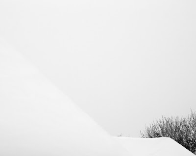
Days of Snow
We had, to everyone's astonishment, a genuinely white Christmas here in Bellingham. It usually snows
here during the winter, but almost never as early as December. This year it snowed on Christmas
Day, and it snowed quite hard, and it has been very cold (as low as 9 degrees according to the Old
Ways of accounting these things, -13 or so according to the moderns, accursed by God.)
There has been sledding. The dog cannot go on long walks because her feet get very cold and then she tries to get around with all her feet in the air which is awkward and doesn't work very well.
Photographing snow is notoriously difficult but I have, of course, mastered the form with a casual ease which must be seen to be believed.
I am in the throes of order fulfillment re: my book presale, and boy it's a lot of work. A full report will be forthcoming in, I think, the next week or two.
Happy Holidays, you reprobates!
Thursday, December 23, 2021
Getting it Right
Sally Mann won the Prix Pictet for some photos she made in a swamp, the "Blackwater" series of
tintypes. Yay! Tom Seymour, of The Art Newspaper, wrote it up in what he un-ironically referred to as a "long-form read" (1900 words) in a piece you may read here: "Ghostly photographs of the Virginia swamp ..."
This piece, despite (as usual) getting passed around by everyone as a great and important piece, is dogshit.
On the one hand, sure, it's got some good material in it, and it reports the facts of a notable event in the world of photography. Sure, Tom Seymour is (it is painfully clear) a generalist with no specialized domain knowlege, banging out some basic reportage on a deadline. Nevertheless, it contains multiple factual errors, and traces a well-worn and shoddy path through the story.
We begin with a discussion of the Blackwater photos, which Seymour covers mainly by quoting Mann, which saved him a couple hundred words of writing. Still, ok. Not a bad choice, Mann is lucid and on-point, and some degree of quotation is absolutely appropriate. This section is OK.
Seymour is obviously completely ignorant of wet-plate processes, making a complete hash to the tintype process: "She captured the charred landscapes using a large-format camera, a signature of her career, before conjuring the images in monochrome tintypes using wet collodion-coated glass plates" which is no particular sin, but just making up some bullshit to replace the knowledge you don't have is a bad habit. The first paragraph of the wikipedia page on "tintype" clears this up, but that clearly requires more effort than Seymour was willing to spend.
He then proceeds through a precis of Mann's early career, landing, of course, on "Immediate Family" and then pretty much stopping there, almost completely ignoring the decades of work that comes between the naked kids and the Prix Pictet. He takes a little detour through "At Twelve" focusing, of course, on the most prurient single anecdote from that work.
Along the way he describes Mann's early film work as wet-plate collodion, which it is not, and again a few seconds of research would have shown him this. But he's certainly not afraid of some purple prose. Seymour again:
At this point we know that he is ignorant of Mann's career arc, obviously, but is he ignorant of what wet-plate looks like, of what Mann's wet-plate looks like, or what the photos in "Immediate Family" look like? Nobody with the smallest clue would think these photos are wet-plate, and most assuredly not Mann's distinctive take on wet-plate, and indeed they are not. These are mostly taken a decade or more before she learned the collodion process as, again, even a quick skim of even wikipedia would reveal.
He also claims that "At Twelve" is wet-plate, which raises exactly the same questions for exactly the same reasons.
Finally, somewhere in there, he tells us that Mann took up photography (she says) to spend time in the darkroom with her boyfriend (true) who was Larry Mann (no he wasn't.)
The pattern is clear, Seymour doesn't know anything about any of the details of anything here, which (again) is no sin. He's a generalist. He gets himself into trouble by (very) hastily skimming a couple of sources, and then extrapolating a bunch of wrong shit that he definitely didn't read anywhere. If he'd even kept to cribbing, he'd have been fine. Evidently he was unsatisfied with that, and felt the need to splice facts together to create falsehoods, and printed those instead.
Eventually some dumbshit MFA student is going to cite this garbage in their thesis, and then it's going to stick, and eventually wend its way back into wikipedia, and then the official story will simply be irretreivably false.
Of course, all journalism is like this. Generalists make up details to fill in the gaps, and move on.
Yes, I have pointed out these errors to Seymour and to the editorial staff of The Art Newspaper.
They simply don't care.
This piece, despite (as usual) getting passed around by everyone as a great and important piece, is dogshit.
On the one hand, sure, it's got some good material in it, and it reports the facts of a notable event in the world of photography. Sure, Tom Seymour is (it is painfully clear) a generalist with no specialized domain knowlege, banging out some basic reportage on a deadline. Nevertheless, it contains multiple factual errors, and traces a well-worn and shoddy path through the story.
We begin with a discussion of the Blackwater photos, which Seymour covers mainly by quoting Mann, which saved him a couple hundred words of writing. Still, ok. Not a bad choice, Mann is lucid and on-point, and some degree of quotation is absolutely appropriate. This section is OK.
Seymour is obviously completely ignorant of wet-plate processes, making a complete hash to the tintype process: "She captured the charred landscapes using a large-format camera, a signature of her career, before conjuring the images in monochrome tintypes using wet collodion-coated glass plates" which is no particular sin, but just making up some bullshit to replace the knowledge you don't have is a bad habit. The first paragraph of the wikipedia page on "tintype" clears this up, but that clearly requires more effort than Seymour was willing to spend.
He then proceeds through a precis of Mann's early career, landing, of course, on "Immediate Family" and then pretty much stopping there, almost completely ignoring the decades of work that comes between the naked kids and the Prix Pictet. He takes a little detour through "At Twelve" focusing, of course, on the most prurient single anecdote from that work.
Along the way he describes Mann's early film work as wet-plate collodion, which it is not, and again a few seconds of research would have shown him this. But he's certainly not afraid of some purple prose. Seymour again:
In a sensual and dramatic monochrome, again exquisitely printed in large format via the wet-plate collodion process, the series depicts Emmett, Jessie, and Virginia, aged six, four and one when she started the project, and 12, ten and seven at the time of the series’ publication.
At this point we know that he is ignorant of Mann's career arc, obviously, but is he ignorant of what wet-plate looks like, of what Mann's wet-plate looks like, or what the photos in "Immediate Family" look like? Nobody with the smallest clue would think these photos are wet-plate, and most assuredly not Mann's distinctive take on wet-plate, and indeed they are not. These are mostly taken a decade or more before she learned the collodion process as, again, even a quick skim of even wikipedia would reveal.
He also claims that "At Twelve" is wet-plate, which raises exactly the same questions for exactly the same reasons.
Finally, somewhere in there, he tells us that Mann took up photography (she says) to spend time in the darkroom with her boyfriend (true) who was Larry Mann (no he wasn't.)
The pattern is clear, Seymour doesn't know anything about any of the details of anything here, which (again) is no sin. He's a generalist. He gets himself into trouble by (very) hastily skimming a couple of sources, and then extrapolating a bunch of wrong shit that he definitely didn't read anywhere. If he'd even kept to cribbing, he'd have been fine. Evidently he was unsatisfied with that, and felt the need to splice facts together to create falsehoods, and printed those instead.
Eventually some dumbshit MFA student is going to cite this garbage in their thesis, and then it's going to stick, and eventually wend its way back into wikipedia, and then the official story will simply be irretreivably false.
Of course, all journalism is like this. Generalists make up details to fill in the gaps, and move on.
Yes, I have pointed out these errors to Seymour and to the editorial staff of The Art Newspaper.
They simply don't care.
Tuesday, December 21, 2021
Something (Really Very NSFW) To Look At
Here's a magazine cover from someplace in Germany I guess. Below the fold because it's
super-explicit closeup of childbirth with all, or rather almost all, that implies.
Good and Appealing
In my youth I attended a moderate number of rock concerts, some quite large, so I have some notion of the
kinds of energy present at these things. At least, the kinds of energy present at them circa 1983, which I
admit is quite some little while ago.
It happens that I've watched some Taylor Swift concert footage over the years, and it seems to me that the energy is a little different. Maybe a lot different.
The notable feature is that many clips seem to contains 10s of 1000s of screaming fans who know every single word of every single song singing along as if their very lives depended on it. I mean, I knew a lot of the words, but my life did not depend on singing them.
What do I think is going on? Well, something that is true about Ms. Swift is that she is a savant of the verse/chorus/bridge song structure. She can grind out well-crafted pop songs basically all day, they just fall out of her food hole. She's a competent singer, guitarist, pianist, but nothing remarkable. Her strength is songwriting. While she lacks Hack Williams's crystalline lucidity, she can really hammer together some words. She does interesting and clever things with the techniques of poetry, but in the end none of this is really her special trick.
Her special trick is this: every song is about you.
That's it. All the songs are about you, or you wish they were about you. Ok, maybe not you as such, but her fans all feel it, and it reaches out pretty broadly. You might be too cool, or too old, or too male, or whatever, but in the privacy of your own home you might remember what it was like to be young, to be like that.
There is no great technical virtuosity here. These songs are well-made, well-produced, pop songs, nothing more. Any number of pop groups and pop songwriters have slammed these things out by the yard. What they have not done is made songs that are about you by the yard. Swift has some sort of weird empathetic sense, she's explicit about just imagining how it might feel to be in some circumstance, and then she writes a song about it, and approximately 1.3 million people react with yes! yes! That song is about ME!
How does this apply to photography? After all, I write about photography, so surely I'm not just writing hagiography about some leggy blonde half my age?
The thing about photographs is they're already kind of about you. If you pay any attention at all to the frame, you're already "there" in a sense.
A photograph that people like isn't a technical tour de force it's a photograph that takes you to a place that you find interesting, or pleasant, or otherwise rewarding. A photograph of, say, a grey-ish jumble of sticks in a forest might not really appeal. You're "there" but so what? It's boring and probably cold. It's about you, but it's a boring song about picking your nose.
A photograph of a red ceiling, though, might catch your interest. You might imagine a pleasant, or thrilling, story for yourself. It's about you, in New Orleans, on that one night, when ...
A photo of a mom is about you, it's about your mom, or the mom you wish you had, or the mom you had in a different life, a mom deep with emotion, love, and strength. Your real mom was probably great too, but this is also a pretty good mom, a mom you'd be proud to have been the child of. It's about you, a you with a rich and interesting life. Of poverty, sure, but as long as you're not actually living it, poverty is interesting. This is a pop song, not real life, remember?
It's probably not fair to say that every "popular" or "well-known" photo is essentially a pop song about you, but there's something here, I am pretty sure.
Humanist photography, certainly, tends to bring us into a kind of virtualized contact with people we wish we'd met, people we'd like to meet, people who inspire us to imagine stories about ourselves. Just like Taylor Swift and that shitty boyfriend who never let her drive his great big stupid old pickup truck, and what we'd have done about that.
So there you have it, the photograph as pop song.
Monday, December 20, 2021
A Trick of the Light
I've noticed this particular frame for a couple of years now, off and on, and finally got around to photographing it a week or two ago. I might have shot it before, but I can't recall.

This is a purely random welter of twigs, wet from the rain, and yet the appearance of circles, of orbits, is quite definite. I had to think about it a little to work it out.
From the perspective we're looking at these twigs, the only surfaces which reliably reflect toward our eye are those oriented to the streetlight in a particular way. The only surfaces we "see" then, are the ones that follow the orbit. The rest are lost in darkness.
There is another tree I observe while walking the dog, with another welter of random twigs. This welter is lit by a security light on a building, which casts shadows on the tree's fairly white trunk. I don't have a photo of this one, it's not very photogenic despite being technically interesting.
The shadows cast on the tree trunk are entirely horizontal. Perfect straight horizontal lines.
This took me somewhat longer to work out. The security light is in fact a horizontal row of LED lights. It is "big" in the horizontal direction and therefore, as it were, wraps around vertical twigs and eliminates their shadows. The light is "small" vertically, and so does not do the same to horizontal twigs. It is, in effect, filtering out verticality. Mathematically, there's probably a convolution somewhere in here.
This led me to think a bit about strip lights. We often see them talked about as a way to create interesting catchlights in portraits (a "cat's-eye" effect, with a vertical strip light on each side) or to rimlight things, or whatever. I don't think I've ever noticed a talk about how a strip light acts like a big light in one dimension, and a small light in the other.
In theory, you should get hard shadow edges parallel to the strip, and soft shadow edges perpendicular to the strip.
This is a preliminary and not very successful attempt to illustrate the effect. I think my faked strip light isn't very good. Don't even ask. I rather like the picture, though.

Work in our labs proceeds.
Update
Further lab work produces these two photos, which make the point.


This is a purely random welter of twigs, wet from the rain, and yet the appearance of circles, of orbits, is quite definite. I had to think about it a little to work it out.
From the perspective we're looking at these twigs, the only surfaces which reliably reflect toward our eye are those oriented to the streetlight in a particular way. The only surfaces we "see" then, are the ones that follow the orbit. The rest are lost in darkness.
There is another tree I observe while walking the dog, with another welter of random twigs. This welter is lit by a security light on a building, which casts shadows on the tree's fairly white trunk. I don't have a photo of this one, it's not very photogenic despite being technically interesting.
The shadows cast on the tree trunk are entirely horizontal. Perfect straight horizontal lines.
This took me somewhat longer to work out. The security light is in fact a horizontal row of LED lights. It is "big" in the horizontal direction and therefore, as it were, wraps around vertical twigs and eliminates their shadows. The light is "small" vertically, and so does not do the same to horizontal twigs. It is, in effect, filtering out verticality. Mathematically, there's probably a convolution somewhere in here.
This led me to think a bit about strip lights. We often see them talked about as a way to create interesting catchlights in portraits (a "cat's-eye" effect, with a vertical strip light on each side) or to rimlight things, or whatever. I don't think I've ever noticed a talk about how a strip light acts like a big light in one dimension, and a small light in the other.
In theory, you should get hard shadow edges parallel to the strip, and soft shadow edges perpendicular to the strip.
This is a preliminary and not very successful attempt to illustrate the effect. I think my faked strip light isn't very good. Don't even ask. I rather like the picture, though.
Work in our labs proceeds.
Update
Further lab work produces these two photos, which make the point.
Tuesday, December 14, 2021
How To Make A Paper-Mache Skull
You can look up how to do paper mache in general in a million places. I use a little salt in some water
and add flour to make a thin paste. Then I soak strips of newspaper in that, and apply them. But this
isn't about that. It's about this:
Blow a balloon up about the size of your head, and cut out a piece of cardboard roughly like shown. A cereal box or whatever. Get some duct tape. Or other tape. Probably doesn't matter. You're going to make a kind of tent out of the cardboard, where one side of the tent is tangent to the balloon.

Duct tape this to the balloon. It's convenient to tape it over the knot. It should look a bit like this but honestly the details don't matter.

A conveniently sized bowl to put the thing in/on will help keep it from sticking to everything. Layer on strips of newspaper over the tented cardboard (this is the "jaw") and the main part of the skull. You'll leave a good sized area on the back/bottom open, through, so don't cover everything. You'll want to get your hands into the interior of the skull later, so leave yourself a nice opening.
Let dry, repeat. Four or five layers is probably enough structure to move on to the next step.

Which is to draw on a face. Just rough it out. You're going to form ridges and whatnot.
To make a ridge, take a long strip of newspaper and soak it in paste. Then twist it into a sort of rope. Dampen the skull along whatever line you want the ridge to follow, then press the rope onto that line. The ropes get mushy and can be shaped, and laid end-to-end or overlapped or whatever. You can be pretty slapdash.
I've done rough brow ridges, some ridges looping over the temples, the nose, and some lumps on the cheeks, here.

While it's still wet, cover with a layer of strips to meld it thoroughly to the skull's surface.

Next up, eye sockets. This is easily the most fun part. It's gross, sticky, and fun. After your skull has dried, using a very sharp knife cut an X into each of the eye holes, all the way through. If you have not popped and removed the balloon yet, this will definitely pop it. Probably a good idea to try to free the skull from the balloon a little before popping it. Cut away any balloon remains.
Cutting the X in each eye creates 4 triangular flaps. While gross and fun, the process has yet to get sticky. More fun awaits.

Form up two balls of aluminum foil, it doesn't matter if they're densely packed or not. Pretty tight, not not rock hard, is fine. They should be of a size to fit through the eye holes, but just barely. Flatten one side so they'll sit up nicely.

Now lay strips of paste-soaked newspaper across one of the balls, in all directions. Several layers. 4? 5?

Now pick this sticky object up, holding it at the bottom, sticky strips of newspaper upwards. Mold the paper to the ball a bit as you hold it. Now JAM IT INTO THE SKULL'S EYE. Push that molded sticky half-ball of newspaper strips into the middle of the X you cut earlier, and shove it through. The bottom surface of your aluminum ball should be slightly below the level of the skull's surface.

The ends of the newspaper strips are all over the place. Smooth them down over the skull's facial surface, the brow ridges, nose, etc. Then do the other eye. The result looks like this:

Inside the skull, it looks like this. The four triangular flaps are kind of hanging out.

Smooth the flaps down over the aluminum foil balls, adding some paste as necessary. Cover the whole thing in a layer of two more of newspaper strips, to meld the whole to the interior surface of the skull.

Let it dry for a bit, at least a few hours, before you pry the aluminium balls out of the eye sockets. My wife loves this part. It feels very very nasty, especially if things are still a bit damp.

At this point the edge of your skull probably looks like this, since it's just edges of newspaper. Probably a good idea to finish that edge with pasted newspaper strips wrapping from one side to the other. Also, adding more layers of newspaper overall as you work is generally a good idea. You'll find that the initial five layers or so is a bit flimsy, although it makes it easier to work and shape the thing.


While the skull is still pretty thin, I cave in the temples a bit, which breaks up the laminated layers and creates a soft spot, but improves the shape of the skull to be more skull-ish.

Adding more layers of paste-soaked paper inside and out re-wets the broken laminate, and allows it to re-set into the new shape, as well as adding strength to the skull overall.
I usually add a couple structural ridges to the interior about this time, using the same method as I did for the facial ridges above.

At this point there's still teeth to sculpt, and the various facial ridges can probably be detailed a little better as well.
Soak up some newspaper in hot water for a while, then drain and shred the paper as fine as possible. A little newspaper goes a long way. A tablespoon or two of shredded paper is probably all you need for a single skull. Add a little salt, and sufficient flour (and add water back in if necessary) to make a fairly smooth mud. Wet down your skull a little anywhere you want to add mud, and have at it.

The mud dries fairly slowly, and will appreciate attention you give it to re-assert any sculpting you've done as it dries. So just rough shaping when it's really wet, and then finer detail as it dries and sets over the next several hours. Just go touch up the teeth whenever you remember to.

When the mud is dried, I cover with another layer of strips.
At this point the nose hole still needs to be cut out, while will expose raw cut edges, and probably break up the laminate a little. Wrapping those edges in more paste-soaked paper will re-set things and clean up the edges, of course.
Let it dry out really thoroughly, and then paint with acrylic paints! Waterproof with a suitable product if desired.

Blow a balloon up about the size of your head, and cut out a piece of cardboard roughly like shown. A cereal box or whatever. Get some duct tape. Or other tape. Probably doesn't matter. You're going to make a kind of tent out of the cardboard, where one side of the tent is tangent to the balloon.
Duct tape this to the balloon. It's convenient to tape it over the knot. It should look a bit like this but honestly the details don't matter.
A conveniently sized bowl to put the thing in/on will help keep it from sticking to everything. Layer on strips of newspaper over the tented cardboard (this is the "jaw") and the main part of the skull. You'll leave a good sized area on the back/bottom open, through, so don't cover everything. You'll want to get your hands into the interior of the skull later, so leave yourself a nice opening.
Let dry, repeat. Four or five layers is probably enough structure to move on to the next step.
Which is to draw on a face. Just rough it out. You're going to form ridges and whatnot.
To make a ridge, take a long strip of newspaper and soak it in paste. Then twist it into a sort of rope. Dampen the skull along whatever line you want the ridge to follow, then press the rope onto that line. The ropes get mushy and can be shaped, and laid end-to-end or overlapped or whatever. You can be pretty slapdash.
I've done rough brow ridges, some ridges looping over the temples, the nose, and some lumps on the cheeks, here.
While it's still wet, cover with a layer of strips to meld it thoroughly to the skull's surface.
Next up, eye sockets. This is easily the most fun part. It's gross, sticky, and fun. After your skull has dried, using a very sharp knife cut an X into each of the eye holes, all the way through. If you have not popped and removed the balloon yet, this will definitely pop it. Probably a good idea to try to free the skull from the balloon a little before popping it. Cut away any balloon remains.
Cutting the X in each eye creates 4 triangular flaps. While gross and fun, the process has yet to get sticky. More fun awaits.
Form up two balls of aluminum foil, it doesn't matter if they're densely packed or not. Pretty tight, not not rock hard, is fine. They should be of a size to fit through the eye holes, but just barely. Flatten one side so they'll sit up nicely.
Now lay strips of paste-soaked newspaper across one of the balls, in all directions. Several layers. 4? 5?
Now pick this sticky object up, holding it at the bottom, sticky strips of newspaper upwards. Mold the paper to the ball a bit as you hold it. Now JAM IT INTO THE SKULL'S EYE. Push that molded sticky half-ball of newspaper strips into the middle of the X you cut earlier, and shove it through. The bottom surface of your aluminum ball should be slightly below the level of the skull's surface.
The ends of the newspaper strips are all over the place. Smooth them down over the skull's facial surface, the brow ridges, nose, etc. Then do the other eye. The result looks like this:
Inside the skull, it looks like this. The four triangular flaps are kind of hanging out.
Smooth the flaps down over the aluminum foil balls, adding some paste as necessary. Cover the whole thing in a layer of two more of newspaper strips, to meld the whole to the interior surface of the skull.
Let it dry for a bit, at least a few hours, before you pry the aluminium balls out of the eye sockets. My wife loves this part. It feels very very nasty, especially if things are still a bit damp.
At this point the edge of your skull probably looks like this, since it's just edges of newspaper. Probably a good idea to finish that edge with pasted newspaper strips wrapping from one side to the other. Also, adding more layers of newspaper overall as you work is generally a good idea. You'll find that the initial five layers or so is a bit flimsy, although it makes it easier to work and shape the thing.
While the skull is still pretty thin, I cave in the temples a bit, which breaks up the laminated layers and creates a soft spot, but improves the shape of the skull to be more skull-ish.
Adding more layers of paste-soaked paper inside and out re-wets the broken laminate, and allows it to re-set into the new shape, as well as adding strength to the skull overall.
I usually add a couple structural ridges to the interior about this time, using the same method as I did for the facial ridges above.
At this point there's still teeth to sculpt, and the various facial ridges can probably be detailed a little better as well.
Soak up some newspaper in hot water for a while, then drain and shred the paper as fine as possible. A little newspaper goes a long way. A tablespoon or two of shredded paper is probably all you need for a single skull. Add a little salt, and sufficient flour (and add water back in if necessary) to make a fairly smooth mud. Wet down your skull a little anywhere you want to add mud, and have at it.
The mud dries fairly slowly, and will appreciate attention you give it to re-assert any sculpting you've done as it dries. So just rough shaping when it's really wet, and then finer detail as it dries and sets over the next several hours. Just go touch up the teeth whenever you remember to.
When the mud is dried, I cover with another layer of strips.
At this point the nose hole still needs to be cut out, while will expose raw cut edges, and probably break up the laminate a little. Wrapping those edges in more paste-soaked paper will re-set things and clean up the edges, of course.
Let it dry out really thoroughly, and then paint with acrylic paints! Waterproof with a suitable product if desired.
Thursday, December 9, 2021
Why We Need Photobook Criticism
There's a piece on Aperture, inside their "PhotoBook Review" label, which argues for
more and better photobook criticism. This is, I have to say, a crashingly unsurprising
point of view to appear within the pages of whatever "PhotoBook Review" is, other
than $18 an issue. You can go read it here.
On the one hand, obviously I am a big fan of photobook criticism. I do it, I read it, I pay attention to the people who do it. I make fun of many of the people who do it, from time to time, on account of their occasional risibility.
On the other hand, this thing rubbed me rather the wrong way.
It begins with a quote from Sontag which is always a dicey operation. It's 50:50 that Sontag reversed course on whatever the quotation means, possibly on the next page. She's a tricky bugger, and will go on for pages on a theme before dismissing the whole thing as a bad job in a line or two. Also, she is a blatherer, and while she talked around a number of good ideas, her writing is mostly just blathering. But whatever, perhaps from this inauspicious beginning David Solo gets somewhere interesting. Or not.
Next up there's a pretty on-point complaint about most photobook writing, being the same as all other reviews of everything in that it's repackaged press-releases. Honestly, I'm not sure about this. Obviously there are press releases, and from time to time they get repackaged as a review, but mostly I think nobody writes anything at all about photobooks. It may be that that as a percentage, we're getting a lot of Serious Criticism, simply because the enture oeuvre is miniscule and there are, after all, 10 or 20 people who try to write seriously.
Solo proceeds through a lot of words which touch on "more cultural viewpoints" and "historical positioning" but which keep returning to the theme of photobook-as-artist-book. It seems to me that what Solo is really interested in is the book-ness of the photobook, the rare Japanese paper, the typography, the design, the gatefolds, the stupid clumsy bindings, and so on, so beloved of the Serious Photobook Community. He explicitly denigrates reviews that he thinks focus too much on the photographs, which is hilarious. These things are photobooks, dude. It's literally in the name.
His conceit appears to be that if only we doubled-down on talking about all that book-nerd shit we could totally expand the audience and legitimize the photobook as a thing. He stops, just barely, short of proposing that a great deal of grant money should be liberated to support "platforms" where he and his friends could place writing about gatefolds and varnish and the fascinating interplay of text and image. This is, apparently, supposed to be a solution to something or other.
It is, obviously, an absurd conceit. Getting deeper into nerd-land is not how you attract civilians to your cult.
A photobook conceived primarily not as a container for a bunch of photos is definitely a thing. It's just a very niche thing. Only a few people in the world really like it. It's like model railroading. It's a thing, it's very cool, and the people who are into it are really into it. Some of them think maybe they ought to be able to make a living at it. In the end, though, they probably should not.
A photo book (note the space) conceived primarily as a container for a bunch of photos can and should use the same assemblage of parts and tools, the Japanese paper, the spot color, the weird bindings (ok, probably avoid the weird bindings, those are almost always a huge mistake. I mean, seriously, Swiss binding? Give me a break. Someone literally forgot an endpaper once and said "we could probably market this dogshit to artists.") The difference is that rather than treating the photos as a way to showcase your awesome idea for a book, you start from the content and try to work out a good way to present the content in a book-like form.
I have seen and even written criticism which attempts to work out exactly how it is that the weird book-nerd shit supports and enhances the content, which is the idea every photobook practitioner trots out. The answer is usually "it does not, in fact, it distracts and is dumb."
This put me in mind of Lewis Bush's book Metropole which I quite liked. My reaction to the twee swiss binding and thread choices, though, is telling. I wrote this review three years ago and I found the book-nerd shit to be trivial and distracting from what is otherwise a pretty good book. This is the norm. It is as if a sculptor decided that what their statue really needs is a plate of cookies next to it or something. The oft-repeated mantra that you must hire a designer or your book will be shit might be accurate, but I would add to that advice "and keep that fucker on a short leash so they don't sell you a bunch of dumb ideas."
In advertising, your agency will come back with three proposals: the one that will win them an award, a throwaway, and the one you actually want. Book designers, at least the stratum of them that work in photobooks, seem to reliably offer up the one that will win them an award. As with the ad agency, your job is to say "no" to that one, and to the throwaway, and to pick out the proposal that you actually want.
I am pretty generous about what constitutes a book, and I am as guilty as anyone when it comes to having a great book idea, and then casting about for some content to stick in it.
I'm working on that.
Monday, December 6, 2021
Christmas Gift Ideas
You're probably scrambling to find the perfect gift for a loved one, about now, but don't worry, Uncle Andrew has you covered. This is what you get:
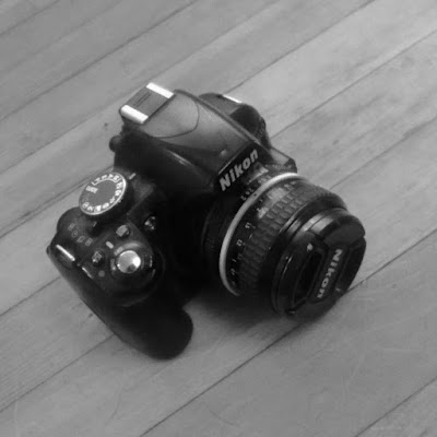
What is this object, you say? It is only the finest and most convenient-to-use camera system yet devised. It is a D3100 DSLR from Nikon, paired with an AIS 50mm lens that's probably older than you are. It might be an AI lens, actually, I'm not sure. This is what I use the most, all these wonderful pictures I share with you are made with this thing. Mostly. Sometimes other lenses, but this one is my favorite.
But Andrew, you say, the D3100 is discontinued, and it was always entry level, can I get one and how does it work with that ancient lens anyway? The answers are: I don't know try eBay, and yes, very handily!
The main thing that makes this great is that all those confusing modes and things go away, because none of them work. There is exactly one way to take pictures with this, and it works like so:
Set the mode dial to anything except Manual. Sunsets, Food, A, Sports, anything other than M. You will need this to focus. There's a little LED rangefinder system in the finder that will help you focus, because sure as shit the finder is no help here optically. The rangefinder system is a little rough itself, so you kinda learn to hunt around a bit inside the "in-focus" range 'a hair left of dead-center is usually about right' sorta thing. So, focus, set your aperture on the lens, and set your shutter speed to whatever.
Technically you can skip this part if you don't care about focus. I won't judge.
Now flick the mode dial back to Manual, because the camera can't see the lens and won't go off in anything but Manual mode. Since you can spin the mode dial either way, only one of which is right, you'll end up in some Pet Portraits mode about 50% of the time and the camera will still refuse to fire. I end up in Pet Portraits mode 90% of the time, because my very existence offends and defies the laws of mathematics.
When you do eventually get it in Manual, it'll go off finally at whatever exposure you've selected with aperture (on the lens, no you can't see the aperture in the finder you big sissy, you have to look at the lens, or count clicks, remember that cute little mirror system that literally showed you in the finder the tiny aperture numbers etched on the lens, though? That was cool. I have one of those cameras too.), shutter speed, and ISO. Metering does not work, so you're on your own, chimp or look at histograms or just guess. Put your goddamned big-boy pants on, ok? We're not here to hold your hand, we're here to make photographs.
No, you can't just leave it in Manual, because the rangefinder only works in every mode that's not Manual, because the camera desperately wants to show you a metering thing in Manual, which is ironic in this case because the meter doesn't work with AIS lenses. So in Manual there's just a blank area at the bottom of the finder, with an AIS lens.
You can leave it in manual and use Live View plus a zoom in to focus, but this is useful only when you're doing studio work on a tripod. I actually do this a lot too. The meter still doesn't work, though.
Anyways. If you'd like to give your spouse a reason to divorce you for Christmas, get them one of these. Please be sure to write me a note with the details on how it went.
And no, I am not kidding. I literally take most of my pictures this way. It's fine.
IT'S FINE.
Friday, December 3, 2021
Truthiness in Photos
Over on C4Journal, we see an article from our friend Lewis Bush, on post-truth photography. I take exception to a couple of points, but essentially he's
offering a fair summary of certain philosophical ideas, pointing out that the Truth of photographs is
a bit dicey, and then plunging into a short survey of some artists nobody has ever heard of who are "playing
with the dialectics" or whatever around Truth and Photographs.
As usual, it is more my intention to examine some adjacent issues, rather than to truly take issue with Lewis's piece.
There are at least two significant contributors to what we might as well call the variability in perceived meaning of a photograph. This variability in meaning is a slight generalization of the idea that a photo is or is not True, of course, but allows us to ignore the issue of whether there is a Ground Truth to be varied from. A photo's meaning might indeed vary from a Ground Truth, but also it varies from your opinion of it, and from mine.
The first source of variability lies in the methods and technologies of the photograph itself. Let's say, the way photographing can shape the story. You can frame or crop things carefully to leave out details which contradict a version of the story. You can select these subjects, and reject those. The whole gamut, right? This is the kind of thing the self-styled experts of Photoland (which includes the editorial team at C4Journal) like to talk about, because it centers the photograph.
The second, and I submit much more important source, is what we as viewers bring to the table.
Consider a riot. We see some photos of it, and we find some opinion. The rioters are good or bad, the cause is just or unjust, and so on.
As a rule, in our western society, the photographs have almost no power to shape these opinions. The photographs will invariably be by-the-numbers generic photographs which serve the purpose of reifying the riot as a riot. These photographs say nothing more than "there was a riot, see?" Essentially the same photos say essentially the same thing about every riot; this is the method of western photojournalism. The very generic-ness of the pictures inures us to any attempts they might make to shape the meaning of the riot.
Our opinion of the riot has, as a practical matter, nothing to do with the photographic shaping of the story, and everything to do with us. A bunch of MAGA-hat wearing yahoos rioting is bad, a bunch of BLM supporters rioting is good, and that is the end of it. It doesn't matter if we saw the riot out the window, heard about it on the radio, or saw some photographs of it. It may surprise you to learn that other people might see these riots in a different way.
Note that this does not imply that every possible photograph works this lightly. I say only that the photos we will likely see will fail to move us. One certainly could photograph the MAGA-hat guys to look more evil, and the BLM guys to look more saintly, but generally the press photographer is looking for the standard set pieces no matter what the riot.
Another way to look at my distinction between the two sources of variable meaning is this: in the first case, the photography matters, and in the second case it does not — we would arrive at the same answer if we saw it with our own eyes.
This, arguably, is the point of the photograph. It is not that the photograph reveals some singular truth, that it changes minds as necessary to align all minds alike. Photographs don't, and never have. The ideal ought to be that they offer an equivalence to seeing it in person, with all the messy variability that brings with it.
There is, I think, a tendency among some theorists to conflate the two. People seeing news coverage of something arrive at different conclusions about it. The media theorist, being a media theorist, assumes that it is the media at fault.
There is little distinction made here between a photographer shaping a story in ways that don't suit the theorist, and a photographer failing to shape a story in ways that do suit the theorist. The generic photograph that treats the BLM-protester and the MAGA-hatter the same way is just as bad as the photograph that makes the wrong distinction between them.
"If only, " they reason, "the photographer had photographed those MAGA-hats to look shittier and dumber, the world at large would see that my point of view is the correct one."
This is... not quite right.
Tuesday, November 30, 2021
Content vs. Form II
A contemporary theory of book design, whether it is the only one, the dominant one, or merely a major one I do not care, runs something as follows.
The design of a book, especially the covers, spine, endpapers, and front-matter, are intended to capture the reader, to bring the reader to the book, and to ease them into the content of same. At that point, design ought to drop out of consciousness, to disappear, and to become a set of silent gestures which ease the consumption of the content. Design in the text block should not, as a rule, be noticed, which is not the same as to propose that it should be absent. Rather, the indications and information that serve the reader are simply clear and present at all times.
Book design, in general, can intrude, or absent itself from the consciousness. On a separate axis, design can help, or hinder the process of reading the book.
In general, contemporary theory proposes that all design should help rather than hinder, and that exterior design should intrude (in good ways) while interior design ought to disappear.
In short: when I approach a book, I am conscious of its book-ness and find it attractive; when I am reading a book, I am oblivious to its book-ness, and am captivated entirely by its content while finding it easy and pleasant to read.
None of these categories, of course, have hard boundaries. Grey areas abound.
Photobooks appear to be mostly made by designers. What happens when you give designers their head is that you get a lot of very intrusive design. All but the very best designers seem to be incapable of trying to make design that's invisible. At one end of the cash scale you get Apple, and at the other end you get photobooks.
A gatefold, like a crease in an automobile's bodywork, is essentially an admission of defeat. Which is not to say that you shouldn't ever do either of them, but you should be aware that you've been beaten by the content because you're not good enough at the job.
In the comments on the previous article in this series, a commenter made reference to the experience of the book-as-object, which is a common conceit in the photobook community. Nobody talks about the experience of the book-as-object when they're talking about Tolstoy, unless they're talking about some absurd collectible edition bound in alligator, but this sort of talk is essentially de rigueur in the world of photobooks. "Ooo, lookit the embossing on the cover, Marge" and so on.
I could argue that this is just wrongheaded, and in a way I kind of am. But the point I want to emphasize is that this is a difference, a characteristic of photobooks which is different from the ways we think of normal books. Photobooks are, by design, frequently made specifically so that the design is intrusive. The form of the thing constantly intrudes, which is the exact opposite of what people do who make books that other people actually want to buy.
It can, obviously, work very well, at least in theory. American Origami uses an absolutely maddening design which essentially dominates the experience of reading the book, making it almost impossible to focus coherently on the content (my review can be read here if you don't recall it.) The design creates a book-inside-a-book structure which plays pretty well with the content, which emphasizes and clarifies the content in interesting ways. It's not a perfect book by any means, but the idea has some merit, and it's a good illustration of what the photobook design crowd is going for.
If you're going for this level of design!!!! you better have some pretty beefy content, or it's just an exercise in design and then who cares? Gonzales has some pretty beefy content, so it works or at least comes near to working.
In general, though, photobook people haven't got any content that demands, or is even aided, by any kind of intrusive design. Mostly, they haven't got any content that should be committed to paper at all, to be fair, but given that they're committed to printing something we have to consider design.
For the most part, the exercise of forcing the content into the form of a codex (or a scroll, or a web page, or whatever) is just going to improve things. If you absolutely have to use a gatefold, or varnish, or a cutout, you should probably go back to your content and reconsider it. You might still need whatever it is, but it's because you lost that round.
Fundamentally, the idea that design, that form, should intrude is a bad default choice. It's not always wrong, but it's one of those ideas that you should visit, and revisit, and be really double-plus sure about before proceeding, and even then you're probably still wrong.
It is not an accident that most "photobooks" do well to sell a few hundred copies, whereas lots of "books filled with photos" sell a great number more. Photobooks as we understand them tend to be form-forward and content-light, and the only people who like that shit are the aficionados who are a) broke and b) not very numerous.
Tuesday, November 23, 2021
Content vs. Form
Recently on twitter there was a brief conversation between some photobook people
about photobooks, and the selling thereof. One person proposed that publishers
should put up all the spreads on the sales web site. Another person agreed,
and said that "photobook people" would buy just the same, or perhaps with
more enthusiasm.
I found this very interesting.
In essence, the proposal is the give away the content of the book, in some sense, as a teaser or advertisement for the form of the book, for the physical object. The suggestion is that this would result in more sales, rather than fewer.
Well, maybe. There's a whole thing around this in the land of text. Certainly in this household the availability of electronic versions of books has cost some sales of some specific books. It may have, for all I know, led to an uptick in total sales, and has certainly increased total consumption of books. Arguably, a digital edition cannibalizes library usage more than sales, etcetera and so on. There's a lot of subtlety here, and the details are not at all obvious.
What's interesting to me here is not really whether or not you'd sell more or fewer books by giving the content away. What's interesting is what the attitude illustrated above tells us about photobooks and photobook people.
The blasé suggestion that one ought to, just naturally, put up all the spreads is at least consistent with the idea that the content doesn't really matter.
The photobook is, to these people and to the "photobook people" they're talking about, primarily an object to be coveted. As a bibliophile myself, I get that. I rather covet all my books. Nevertheless, it would never occur to me to put up all the content for free, of a book I was seriously trying to sell. I give away content a lot, but always for things I am simply giving away.
My interest in the book with photographs is specifically in the content, the ways you can shape the things you put in there to produce, well, results of some sort. I don't really care about the form, the object. Most of the objects I made are cheaply made boxes whose sole function is to contain content.
This is, of course, in contrast to much of the photobook industry, which is in the business of globbing ink as thickly as possible onto the page, in a sort of pitiable attempt to approach the Fine Print, which is itself a sort of pitiable attempt to emulate the Original Oil Painting, all of which is in my opinion a kind of bankrupt enterprise.
It is maybe not surprising that a Very Successful photobook sells 1000 copies, if the content isn't important. We see this sort of thing brought to a kind of apotheosis with things like Paul Graham's Mother which, for those who are not thrown into an instant rage by the reference, a small book consisting of 14 substantially identical portraits of Graham's mom. It is by all accounts a lovely object, an object to be coveted. But the content is essentially zilch. There's almost nothing there. "A boy loves his mom, news at 11."
Now, I don't really know if the people in the original conversation don't much care about content, or if they simply think their target market doesn't much care about content, and it doesn't matter. The point is, this attitude exists, and is to a large degree driving this little industry, and I don't think it's a good thing.
Content does so matter, damn it.
Monday, November 22, 2021
Sticky Ideas
I keep finding new examples of a thing. People have some idea, and they completely believe it. But it's
an idea that 10 minutes of honest research and/or thinking would invert. Let's take "photographs are violent"
as an example, but there are lots of others.
This is an idea which is, basically, stupid on the face of it. If you examine the idea head-on your first impression has to be something like "what now? That makes no sense." A photograph is, after all, just a piece of paper with smudges on it. Ok, so people who "believe" this have somewhat broader and more nuanced definitions of both "photograph" and "violence" but it still doesn't work.
If you go on a lengthy road-trip trying to find out what the basis for this belief is, you will find some not particularly robust theorizing about media as a complete system, and then a sort of abrupt step to invidual photos, and then the idea is simply repeated over and over and accepted as Obviously True.
What's interesting to me in this moment is not that this specific thing is happening, but that the same thing happens constantly. It follows that you and I live, ourselves, in a sea of similarly wrong ideas; ideas which if we examined them carefully we would discover that they are basically wrong. Maybe they're not well supported, maybe they are in fact exactly the opposite of true, whatever. Odds are, we have a lot of this shit that we believe because our father believed it (or believed the opposite) or because our friends do. There isn't enough time to examine all our beliefs, we're pretty much stuck just getting on with life because the dishes are not going to do themselves.
Furthermore, beliefs that are consistent with other things we believe, whatever the nature of those beliefs, are harder to shift. The "photography is violence" crew have a fairly complete world view of which this is one item. To my eye, the whole thing is junk, but there we have it. Libertarians are also a thing, and their world-view is equally complete and equally, to my eye, nonsensical.
This matters, at least to me, because I want to understand the breadth of possibility in what people bring to photographs. Obviously it matters in the larger world as well (the question of "what's up with all those <name a political stance> people anyways?" looms rather large in this era.) But for the purposes of this blog, we need to understand that people approaching a photograph differently from us are not lying, or disingenuous. Not necessarily. They may simply be hewing to a system of belief that appears to us nonsensical. At the same time, we are hewing to a system of belief that they view as nonsensical.
Naturally, I am sure that my ideas are all carefully checked out, and probably correct. Or at any rate I would be if I wasn't pretty aware that this is just another of those nonsensical world views.
Something you can usefully do, especially as a critic, is to take seriously the possibility that you're wrong and the other fellow is right. It might not actually change your stance, but any attempt to grasp the other fellow's position will help you make sense of where they're coming from, and in turn why they see the photo (or whatever) this way rather than that way. A certain breadth of open-mindedness is, I think, necessary if you wish to see how media, art, what-have-you, fits into culture.
To a large extent, this breadth is lacking from the critical discourse around photography. The complete and distinct world-view pointed out above is seen as objective truth, and there's no need to examine alternatives. These are not open-minded people.
So, while I happen to think that the "photographs are violence" notion is silly, I have struggled with it, and continue to do so. It does indeed reveal much about how other critics are seeing photographs. It reveals why and how their analyses diverge from my own.
Am I right? Well, obviously I think so, otherwise I'd have different beliefs, wouldn't I? But I can't know for sure. It's up to you to work out who's making more sense which, in the end, boils down uselessly to working out who's telling a story that lines up better with your collection of beliefs, your own deeply flawed world view.
It's enough to make a boy into a nihilist!
Tuesday, November 16, 2021
Book Sale: Vigilante
This is a soft-launch of my book sale. I am hoping to sell 100 copies of this Vigilante zine/book thing that I made on
blurb. It's a fun little local-art thingy, 15 bucks gets you a copy of the thing. US/Canada only because I am too dumb to
work out international shipping, and it's my first time so I am keeping it simple.
It's a gofundme campaign, because Tim at Leicaphilia used that platform to sell his book and it seemed to work ok.
Vigilante: 30 day book sale
I basically want to know, at this point, if all the links and videos and crap work and are pointed at the right places. Feedback most assuredly welcome!
Also, please buy my book!
Many of you will likely be receiving directly emailed pleas, which you can ward off by buying early.
Monday, November 15, 2021
Objectivity
Over the last week or so I've been observing and remarking on some shoddy forensic analysis of photos. Never mind where or who. Several academics with alleged expertise in documentary photography and ethics weighed in. It was not a good situation. This is the photo in question:

It's shot by Ralph Pace, and was a contest winner at World Press Photo (I gather that it's done well more broadly). Obviously, it looks weird to the untrained eye. The mask really pops. This is why it's a contest winner: contest winners often look weird. The point is to stand out, after all. Anyways, one of the academics decided to Investigate Using His Skills.
First he applied Error Level Analysis (ELA) which, as it always does, detected the sharp edges. The astute observe will notice that this mainly means the mask in this picture. ELA is thoroughly discredited trash, even by design it only detects a narrow band of composites that no serious photographer would ever produce, and it is notoriously hard to interpret. It is, for all practical purposes, a false-positive farm. That said, our Serious Academic read the results completely wrong. The tutorial on ELA's inventor's web site specifically calls as not relevant out the features our hero notes as evidence.
Moving on, our boy zoomed in on the mask:

He notes that the KN95 marking is backwards, and speculates that this could be a flipped image. In passing, he notes that mayyyybe we're looking at the inside of the mask, but there's no way to know for sure.
There is, in fact, a remarkably obvious and clear way to tell that you're looking at the inside of the mask. Do you see it?
Regardless, it doesn't matter and this particular shitshow is not my point.
The point is that the first academic and then a second one, looked at this closeup of the mask, wondered if we were looking at the inside, and completely failed to notice the obvious tell. What the hell is going on here?
Maybe they were both having a bad day. Maybe they suffer from cognitive or visual deficits that prevent them from seeing things. It could be a lot of things. My guess though is that they both approached the picture assuming that it was a composite, and that the closeup mask was therefore a flipped photo. Despite handwaving toward the other possibility, they were not able to take it seriously. They never made even a silent, internal, feint at "ok, what else is there in the picture that suggests that it has not been flipped."
If true, this exhibits a remarkable degree of bias. The closeup simply hasn't got many features, the tell is one of a very small number of things that can actually be seen. It's not hiding. If you were to enumerate the Things Which Can Be Seen in this thing you'd get, I don't know, you might be able to stretch it out to a dozen elements and that only by counting both elements of some pairs. You have to really not try even slightly to prove that you're looking at the interior of the mask.
So what we have is a pair of academics (one is doing post-doctoral research in aspects of photojournalism, the other is in a PhD program on other aspects of photojournalism) who apparently cannot work out the ground truth of a remarkably simple photograph. I don't expect everyone on earth to be able to solve this puzzle, so if you can't, don't feel bad. But this is literally their wheelhouse, this is their area of expertise. I do not see how you can study photojournalism seriously and be unable to figure out what the hell you're looking at.
Tragically, I am convinced that this is in fact normal in the field. I am surprised only at how far personal bias can take you into the land of blindness.
The academic community has correctly observed that bringing a true and unambiguous objectivity to a photo is a pipe dream, it is not realistic to think one can do this. Your default posture is intensely personal, you bring your biases, beliefs, history, etc to the table. This influences which things you notice in a photo, and which you do not. This, in turn, influences what kinds of extrapolations you build upon the photo, to recreate the world that you're looking at. This is inevitable.
The proper response, one I have advocated at some length here and there, is to do your best. There isn't any choice, you have to try, because otherwise you can't do anything. You have to develop the skill of looking at a picture with a moderate degree of neutrality, and seeing what is actually there. There are techniques you can use, and practice always helps, naturally. Can you make it perfect? No. Can you do better than these guys? Unquestionably yes.
The response from the academy appears to have been to simply abandon all hope of objectivity. They make no serious attempt to bring anything but their own selves to the picture. All you can learn from their discussion of any photos is what a kind of prog-left weirdo/mediocrity might make of the picture. This could be fine, I have no problem with people explaining their personal reactions to things. It can be lovely and fun and enlightening.
We run into trouble when they present, as they all too often do, their own biased and personal reading out as some kind of truth. Either they claim their reaction as more or less universal, or if not universal at least the right one (who cares what fascists thing, amirite?) and sometimes as ground truth.
In the case we began with, we have a remarkable situation: a combination of ignorance, bias, and laziness (nobody involved actually went and located a KN95 mask to see what they look like, or photographed one to see how light falls on them. well, except for me. the farthest anyone else went was, literally, a google search.) leading to an accusation of fakery which is in the end founded on literally nothing. There is no evidence presented that stands up even slightly. The only thing we have is "well, the photo looks weird" which is does only if you don't know what white things photographed underwater with a flash look like.
The original accusation has been tempered with a lot of "well, I'm not sure so everyone should keep an open mind" which is insane, because there is, again, literally no reason to believe one of the two sides. While this thing could be a composite, literally no evidence of any kind has been presented that it is, and the World Press Photo people have attested that their forensics team has passed the photo as not-composite. At this point it borders on ludicrous to hew to the "faked" theory, at least if you're paying attention.
What we have is a biased, personal, reading being presented as not even as a universal, or some kind of cultural truth, but as literal ground truth.
This is where photo criticism has gone to die. In the hands of incompetents leaning on incoherent, unworkable, theories to produce nonsense results. Not quite the results we're looking for.
The tell, by the way, is the straps of the mask. These are always adhered to the outer surface of the mask. Placing them on the inside would break the seal, such as it is.
Thursday, November 11, 2021
"A World in Ruins"
Here is a kickstarter campaign for a photobook: A World in Ruins from Blueboat Press in the UK, photographs by James Lacey.
Bluecoat did Jim Mortram's Small Town Inertia which is a book that appears to be superb, and which I keep meaning to buy without ever actually getting around to it. The point here being that Bluecoat seems to be a stand-up outfit, so one wonders what the fuck they're doing publishing some shitty UrbEx project. One can only imagine that it's to pay the bills. I am vaguely surprised that this thing hasn't hit a billion dollars by now, but I guess in the general fade of photography interest, you maybe can't sell even this crowd-pleasing stuff as well any more.
Let's think a little about this category of stuff. I hate it, without reservation, and I (abstractly, not personally) hate the people who do it.
What do these pictures do? Well, they transport us to the interiors of abandoned buildings. We are there, in what remains of some other human endeavor. An abandoned home, or business. We see the detritus of a life, of a job, of an enterprise. We can see the bits and pieces, and we can imagine the lives that were here before. We feel the presence of ghosts, in a sense, as we spy on their stuff, on their life.
It is a kind of unsavory voyeurism. We're not supposed to be here, it's not our home. These are private things, that were intended to be shut away from prying eyes. The photograph makes this expedition of snooping safe, nobody is going to burst in on us demanding answers. Nobody need even know we're doing it.
These projects represent the worst of our gossipy, nosey, humanity. We can sneak about, but we can't be caught. It's fucking catnip. Which is why these goddamned things have traditionally always sold really well, and why people love these pictures, and thus why people keep taking them. The photographer could be caught. The photographer is being a nosey little sneak, but is at least taking the corresponding risk. He takes the risk, because he craves the social media likes.
None of this is very healthy.
If you think about it for more than a few moments, you realize that neither is it even real. There is a secondary layer of shittiness here!
All these guys have a story about how they never force entry, and they never disturb anything they find inside. This supports the viewer experience: "this is all real, just as it was left lo those many years ago" and also makes us feel better about being so nosey. Our proxy didn't actually break in, you know, "it was already open, so it's ok, right?"
Well, when James Lacey says that he only uses "natural entry" he does not mean "the ivy gently and naturally unlocked the front door" it means "someone else kicked the front door in." He also says " I leave the buildings as I find them and treat them with the respect they deserve after documenting them." UrbEx guys all say this, and we can be pretty sure some of them are lying. These doors are not kicking themselves in.
Let us cast our mind back to, I dunno, 1970. A house is locked up for the winter, dust covers over the furniture, dishes all put away, shutters closed, doors locked. Someone dies, the house is embroiled in some dispute of inheritance, and is somehow lost track of. It passes to the cousin in Australia, who later dies and leaves it to his children who don't care. The house is abandoned.
By 1990 it's visibly decrepit and overgrown. Some homeless guy, a local teenager, an Urban Explorer, someone kicks the door in to snoop around in there. Indeed, people come and go. People take up residence briefly, and move on.
The dust covers come off, shutters and curtains are opened. Curiosity or just a desire to sit down in the light. Someone digs out some blankets because they're cold. An UrbEx photographer sets the table because that looks cooler. As we've seen by examining photographs from the area around Chernobyl, photographers move things around, and bring in objects, relentlessly. The idea that some abandoned home is immune to this is ludicrous.
So, what we are actually looking at is the detritus not of a life lived, but of endless streams of visitors. Some want shelter, others want photographs, some are just nosey.
All these UrbEx guys are attracted to the mystery, so they say. Why is the chair placed there? Well, bub, it's almost certainly there because some other UrbEx idiot thought it would be more photogenic placed there. Which is probably why it's so photogenic there.
These things are dressed sets, dressed mostly with the detritus of the house, dragged out of various closets and boxes and the attic. I dare say there's a certain amount of material that's been dragged in as well. There is reason these damned pictures are so perfect, it's because many photographers have re-arranged them over and over, over literally years, until they look like that.
Sure, it's perfectly possible that James Lacey has never kicked in a door, but ironically the only way to reliably take the unsullied photos he claims to be taking is to kick the door in. Once the door has been kicked in, people are coming and going, people are moving things around, people are sullying the scene.
Tuesday, November 9, 2021
Language and Art
It is often said that photography, or art, has a language. This is definitely not true, although there's a related thing that is. Language, it turns out, is a pretty well defined concept. The "language" of art has no structure, no grammar, no syntax. The "words" of Art's "language" are not particularly abstract in, for example, the sense that "dog" is an arbitrary noise which refers to the same category of objects as the equally arbitrary noise "chien" does. What Art has is, maybe, a vocabulary. Essentially, the artist throws symbols down, symbols which are anything but
arbitrary, in more or less a jumble and leaves it to the Art Consumer to sort it all out.
In Art and Revolution Berger writes:
As a side note, it is worth remarking that the antecedent of "its" at the end there is not grammatically clear. You have to work from context that the antecedent is "subject" not "procedure/formal means." The cynic in me wonders if modern Art Writers have trouble working this sort of thing out, and have therefore decided unconsciously that it simply doesn't matter. This might explain why so many of their pronouns appear to be untroubled by any antecedent at all.
Back to business.
Having dismissed the analogy to language, I am now going to lean in to it. Isn't this fun? Language evolves, according to pretty well described mechanics. When snowboards were invented, a whole world of vocabulary was invented to describe the boards themselves, the things people did with them, the culture surrounding them, and so on. A lot of borrowing, some neologisms, etcetera and so forth. The point is that here was a subject which literally had not existed, and language was hurriedly developed to "admit its special case." Art, likewise, is trying to say new things, about new pieces of the human experience or whatever. Berger was pretty big on the idea that Art continues to evolve and grow because the (human) world continues to evolve, so there are always new things to be said.
I am going to make up an entirely arbitrary distinction, and assign arbitrary terms: I will refer to art-like things which are made relying on existing tropes and vocabulary as "media" and I will refer to art-like things which develop new tropes, new vocabulary, as "art." Obviously there is a spectrum here, as well as a relativism. If you have never heard of cubism, you might re-invent it to solve some contemporary artistic problem you have. This would make it, um, "art" for you, but "media" for everyone else? Also, of course, there is no distinct line between a "new trope" and an "old trope." Let us briskly sweep all this messiness under the carpet, on the assumption that you are clever enough to follow along, make allowances, and perhaps find something useful in what follows. In spite of it all.
The hard problem in art is to shape material to meaning. A working artist, a working maker-of-media, generally has a toolbox of method. The temptation is always to simply reach into the box and draw out the tool that seems least unsuited to the task at hand, and then to have at it. The result of this rarely satisfies, although photographers often seem to draw satisfaction from perfecting the use of the tool itself rather than the shaping of material which the tool enables. Language, and by analogy, media can say infinitely many things, but it is nevertheless constrained by itself. You cannot write effectively about snowboards using the vocabulary of skiing. You can write, but the result is clumsy and unpleasant to read.
In the same way, you cannot solve a new artistic problem in a satisfying way using purely the methods devised to solve other problems. When confronted with a new world, as we in some sense are every day, a new world about which new things can be said, we ought to constantly revise our tools. We ought to constantly devise new vocabulary. As with the vocabulary of snowboards, our new vocabulary will likely contain borrowings and neologisms. Because we know, instinctively it seems, how language evolves, we can understand these neologisms when snowboards appear on the scene. In the same way, we should understand the "neologisms" that appear in new art not because they are well-known elements of vocabulary, but because we understand how new vocabulary is formed. We can at any rate puzzle out what this new thing is supposed to be, if we apply ourselves. In theory.
All of this is, of course, very squishy. What is a "new" trope, and what is merely a "recycled" trope, anyway? There is no clear line between the two. And yet, the lack of a clear delineation does not prove the absence of categories entirely. We can recognize the possibility of a new trope, we can recognize an old trope, and at the same time acknowledge that there's probably a pretty large and subjective grey area. The point is that we strive for the one side of the spectrum. We strive to shape our formal means to the special case of our current subject.
This is not to suggest that you must first define your intended meaning, then proceed to develop a new method or set of methods, and finally, and only then, begin painting. One could, I suppose, but it doesn't sound like a lot of fun. In reality we simply begin. Meaning may never truly become clear, although surely something or other will emerge before we are done (otherwise, perhaps we ought to stop and do something else, no?) As we work, though, the material of our work, that mess of subject, meaning, medium, may propose a method. We should be open to that proposition.
There are, essentially, two risks here, one on each side of the path as it were.
On the one hand, it is tempting to stick with the methods we know and trust, methods which have served us well in the past. We've said things before with these tools, surely they will work for us again. Indeed, they will, but they may prove incapable of saying the things we need to say. This is to reject the proposals offered by the material of the work, which we ought not to do. Photographers do this a lot, grinding out endless repetitions of successful pictures from their past, and claiming it as "my style."
Let us take a moment to return to my earlier definition of "media." If it is your intention to produce media, perhaps you are reporting news, then by all means you should use the tools in the box, the vocabulary you trust. Media is not about wrestling with new ways to express new things, it is entirely about using tried-and-true vocabulary to express as best we can whatever it is we're trying to say. Nobody thinks that this riot would be best expressed with wet plate, whereas that riot was really best captured in digital color. From the point of view of media, a riot is a riot, and they're all the same, and should be photographed the same. Chuck in a skyline shot so people know what city it was in.
Back to the other risk, on the other side of the path:
On the other hand, it is tempting to try out variations and methods new to us, for their own sake. We hope that something or other will emerge, despite the fact that the material of the work is making no such proposition. Our efforts on this side are effectively random, not being driven by the work itself, by the meaning that is struggling to make itself known. Photographers, different ones, also do this, a sort of random hopeless dicking around with process, buying lenses or learning to do wet plates, or taking up Brenizer's method for no discernible reason.
It is not so easy to distinguish between "meaning trying to make itself known" and a mere rationalization of a photographer's desire to dick around with something new. There may not even be a clear dividing line. It is at this point that some sort of notion of meaning is probably useful. If you don't have any notion of where you're going, any method is equally pointless. When the urge to try wet plate photography steals up on you, it might not be amiss to ask yourself what problem, exactly, this is supposed to solve.
I recently went to a little bit of trouble to make a pinhole for my camera, thinking it might solve an artistic problem. The jury is still out on this, but at the moment it's looking like "no."

There is no doubt that the pinhole does something, I can see and articulate what that something is ("dreamlike" or whatever,) but what I cannot quite persuade myself of is that it's solving the underlying problem I have set myself. I'll keep the pinhole, but it probably isn't the method here.
In Art and Revolution Berger writes:
A subject is revealed in art only when it has forced the artist to
adapt his procedure, to admit in terms of his formal means its special
case.
As a side note, it is worth remarking that the antecedent of "its" at the end there is not grammatically clear. You have to work from context that the antecedent is "subject" not "procedure/formal means." The cynic in me wonders if modern Art Writers have trouble working this sort of thing out, and have therefore decided unconsciously that it simply doesn't matter. This might explain why so many of their pronouns appear to be untroubled by any antecedent at all.
Back to business.
Having dismissed the analogy to language, I am now going to lean in to it. Isn't this fun? Language evolves, according to pretty well described mechanics. When snowboards were invented, a whole world of vocabulary was invented to describe the boards themselves, the things people did with them, the culture surrounding them, and so on. A lot of borrowing, some neologisms, etcetera and so forth. The point is that here was a subject which literally had not existed, and language was hurriedly developed to "admit its special case." Art, likewise, is trying to say new things, about new pieces of the human experience or whatever. Berger was pretty big on the idea that Art continues to evolve and grow because the (human) world continues to evolve, so there are always new things to be said.
I am going to make up an entirely arbitrary distinction, and assign arbitrary terms: I will refer to art-like things which are made relying on existing tropes and vocabulary as "media" and I will refer to art-like things which develop new tropes, new vocabulary, as "art." Obviously there is a spectrum here, as well as a relativism. If you have never heard of cubism, you might re-invent it to solve some contemporary artistic problem you have. This would make it, um, "art" for you, but "media" for everyone else? Also, of course, there is no distinct line between a "new trope" and an "old trope." Let us briskly sweep all this messiness under the carpet, on the assumption that you are clever enough to follow along, make allowances, and perhaps find something useful in what follows. In spite of it all.
The hard problem in art is to shape material to meaning. A working artist, a working maker-of-media, generally has a toolbox of method. The temptation is always to simply reach into the box and draw out the tool that seems least unsuited to the task at hand, and then to have at it. The result of this rarely satisfies, although photographers often seem to draw satisfaction from perfecting the use of the tool itself rather than the shaping of material which the tool enables. Language, and by analogy, media can say infinitely many things, but it is nevertheless constrained by itself. You cannot write effectively about snowboards using the vocabulary of skiing. You can write, but the result is clumsy and unpleasant to read.
In the same way, you cannot solve a new artistic problem in a satisfying way using purely the methods devised to solve other problems. When confronted with a new world, as we in some sense are every day, a new world about which new things can be said, we ought to constantly revise our tools. We ought to constantly devise new vocabulary. As with the vocabulary of snowboards, our new vocabulary will likely contain borrowings and neologisms. Because we know, instinctively it seems, how language evolves, we can understand these neologisms when snowboards appear on the scene. In the same way, we should understand the "neologisms" that appear in new art not because they are well-known elements of vocabulary, but because we understand how new vocabulary is formed. We can at any rate puzzle out what this new thing is supposed to be, if we apply ourselves. In theory.
All of this is, of course, very squishy. What is a "new" trope, and what is merely a "recycled" trope, anyway? There is no clear line between the two. And yet, the lack of a clear delineation does not prove the absence of categories entirely. We can recognize the possibility of a new trope, we can recognize an old trope, and at the same time acknowledge that there's probably a pretty large and subjective grey area. The point is that we strive for the one side of the spectrum. We strive to shape our formal means to the special case of our current subject.
This is not to suggest that you must first define your intended meaning, then proceed to develop a new method or set of methods, and finally, and only then, begin painting. One could, I suppose, but it doesn't sound like a lot of fun. In reality we simply begin. Meaning may never truly become clear, although surely something or other will emerge before we are done (otherwise, perhaps we ought to stop and do something else, no?) As we work, though, the material of our work, that mess of subject, meaning, medium, may propose a method. We should be open to that proposition.
There are, essentially, two risks here, one on each side of the path as it were.
On the one hand, it is tempting to stick with the methods we know and trust, methods which have served us well in the past. We've said things before with these tools, surely they will work for us again. Indeed, they will, but they may prove incapable of saying the things we need to say. This is to reject the proposals offered by the material of the work, which we ought not to do. Photographers do this a lot, grinding out endless repetitions of successful pictures from their past, and claiming it as "my style."
Let us take a moment to return to my earlier definition of "media." If it is your intention to produce media, perhaps you are reporting news, then by all means you should use the tools in the box, the vocabulary you trust. Media is not about wrestling with new ways to express new things, it is entirely about using tried-and-true vocabulary to express as best we can whatever it is we're trying to say. Nobody thinks that this riot would be best expressed with wet plate, whereas that riot was really best captured in digital color. From the point of view of media, a riot is a riot, and they're all the same, and should be photographed the same. Chuck in a skyline shot so people know what city it was in.
Back to the other risk, on the other side of the path:
On the other hand, it is tempting to try out variations and methods new to us, for their own sake. We hope that something or other will emerge, despite the fact that the material of the work is making no such proposition. Our efforts on this side are effectively random, not being driven by the work itself, by the meaning that is struggling to make itself known. Photographers, different ones, also do this, a sort of random hopeless dicking around with process, buying lenses or learning to do wet plates, or taking up Brenizer's method for no discernible reason.
It is not so easy to distinguish between "meaning trying to make itself known" and a mere rationalization of a photographer's desire to dick around with something new. There may not even be a clear dividing line. It is at this point that some sort of notion of meaning is probably useful. If you don't have any notion of where you're going, any method is equally pointless. When the urge to try wet plate photography steals up on you, it might not be amiss to ask yourself what problem, exactly, this is supposed to solve.
I recently went to a little bit of trouble to make a pinhole for my camera, thinking it might solve an artistic problem. The jury is still out on this, but at the moment it's looking like "no."

There is no doubt that the pinhole does something, I can see and articulate what that something is ("dreamlike" or whatever,) but what I cannot quite persuade myself of is that it's solving the underlying problem I have set myself. I'll keep the pinhole, but it probably isn't the method here.
Tuesday, November 2, 2021
The Fallacy of Proximity
In the world of cryptocurrency, which has metastasized to encompass NFTs and DAOs, and which will undoubtedly produce more acronyms before the end, the underlying technology is blockchain. It doesn't matter what any of these things are, the key point here is that blockchain is a technology which literally cannot solve any problems. There is no problem yet identified for which it is anything more than an extremely bad semi-solution.
What happens is that someone builds some kind of system, for "money" or "art" or whatever, which they claim has some interesting, fun, useful properties. In general, it in fact has none of the claimed properties, but that's a separate conversation, so let us stipulate that the system actually has the relevant properties and is in fact interesting, fun, useful. The system has, somewhere in it, blockchain. The people building the system and, importantly, selling it, will loudly claim that it's the blockchain what done it!
It's the blockchain that enables all the desirable properties!
This is also false, and is the subject of today's post. Blockchain, whatever it is, doesn't solve any problems. It is not capable of solving problems. The system these people have built relies on blockchain not even in the slightest, they could have built functionally the same system on practically anything else, and it would have been better. But, for reasons that have to do with the massive grift that is crypto, they built it on blockchain.
Here we see the first instance of the fallacy of proximity. We can see blockchain right there in the system. We are told that it is this that makes the system interesting, fun, and useful. The fact that blockchain is nearby, however, does not imply a causal relationship.
The important distinction is this: in order for A to cause B, A needs to be positioned somewhere at a point of leverage. This is true. However, if C is positioned at a point of leverage, we cannot deduce that C caused B. C could just be sitting there, doing nothing. The fact that it is positioned near B does not mean that it caused B.
In order for the truck (A) to run over the cow (B), the truck has to be on the same road as the cow. The Honda Civic (C) that was also on the same road, however, did not run over the cow (B.)
This is apparently hard for people to grasp, and is absolutely a point of entry for grifters, other people with agendas, and indeed anyone who's looking for causes.
This is, I think, the root of some obsessions with process in Art. People are trying to cause some Good Art to happen, so they try out shit that feels nearby. If they manage to produce something not bad, they are likely to ascribe the cause to whatever process they were doing.
"See, I was eating vegan and meditating that week, so now that's My Process because that's how you make Good Art, sign up for my workshop on how eating vegan and meditating can help YOU make Good Art too!"
Now, the production of Good Art can be a bit mysterious, so I am loathe to condemn any particular artist and their process, but as a generality I consider it likely that a lot of process is simply wasted effort. We just don't know which parts.
This is also a favorite argument in the land of academic photography. Ariella Azoulay's writing (but they all do it) tends to boil down to "bad thing happened, and there was a photographer nearby, therefore photography is very violent and bad" which is, again, to suppose that the Honda Civic ran the cow over. Azoulay would likely allow as to how the truck also ran the cow over, but she's pretty sure that the Civic did as well.
Indeed, really, every car is complicit the the murder of the cow, when you think about it.
These arguments go over really really well, it turns out. People, whether they're buying NFTs or reading academic papers about how poisonous photographs are, find the Proximity argument very convincing.
As a reformed mathematician, I don't, but I'm pretty sure I'm the odd one out here.
Subscribe to:
Posts (Atom)